Visual Design Projects
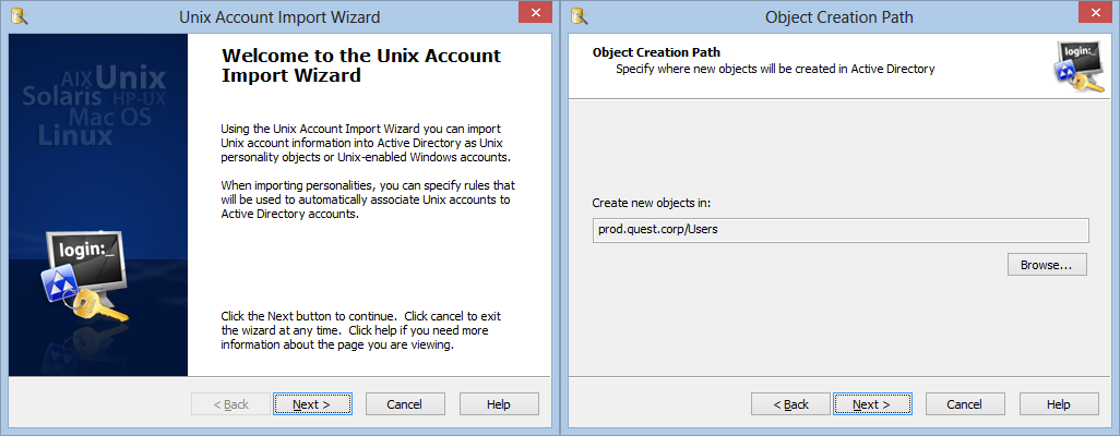
Authentication Services | Rebranding & Visual Design
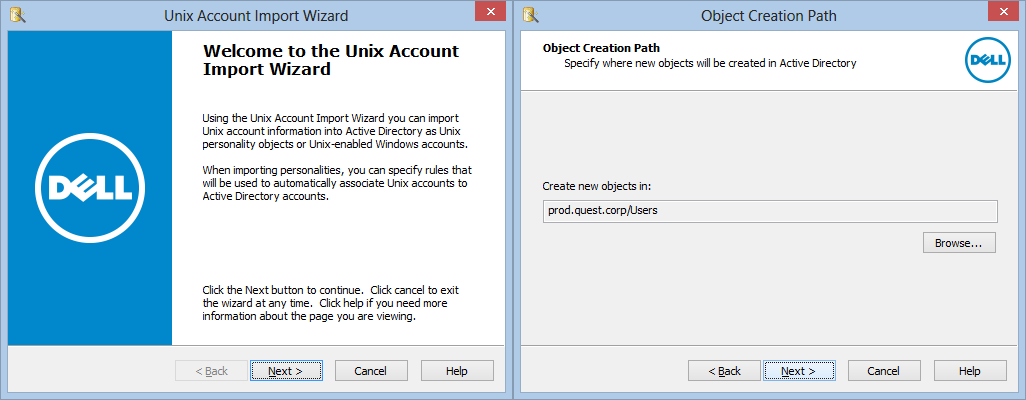
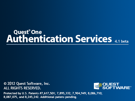
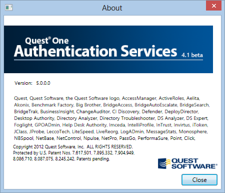
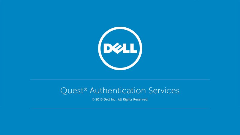
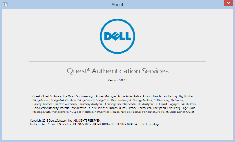
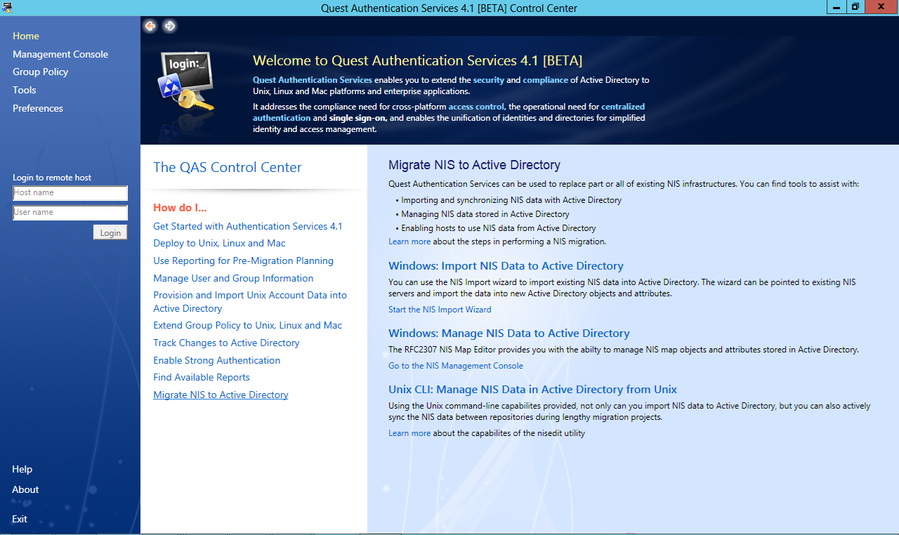
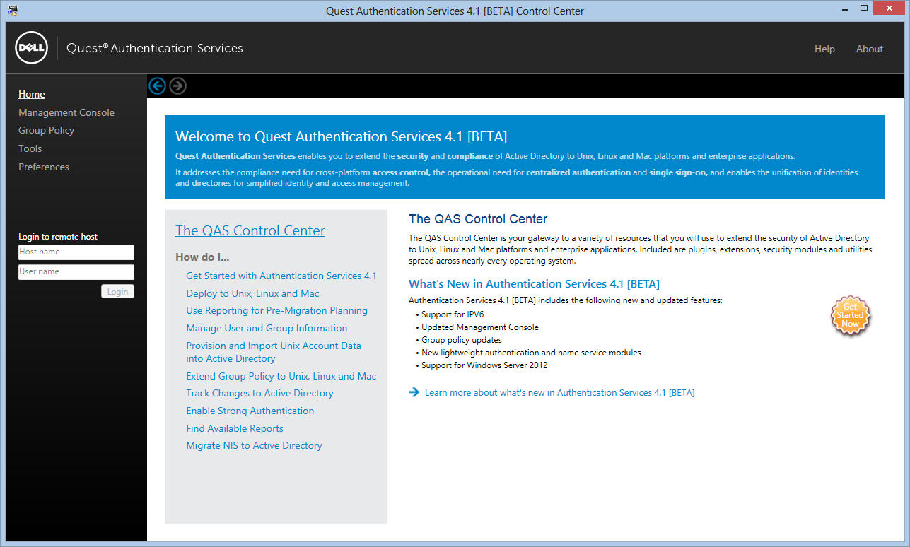
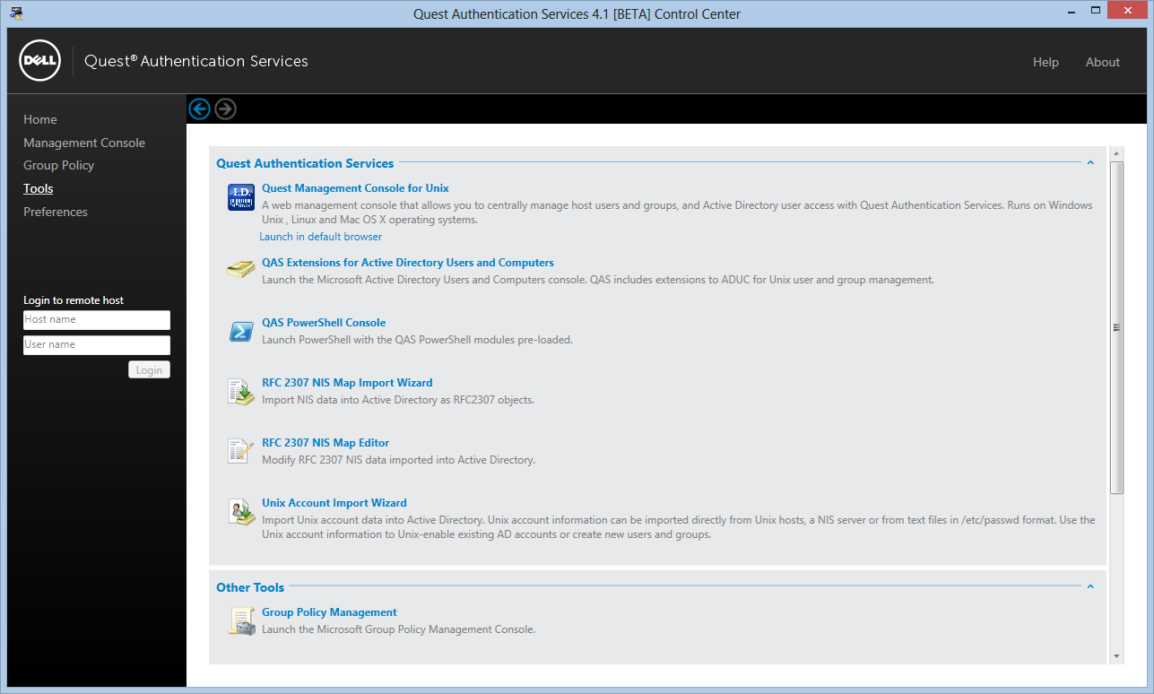
After Dell aquired Quest Software we needed to take the legacy products and update them so they would adhere to Dell's standards. In order to change to the Dell standards I had to create new graphics in Photoshop and Illustrator as well as manipulate the applications XAML code. Here are the before and after screenshots taken of the product Authentication Services.
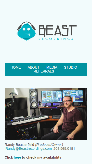
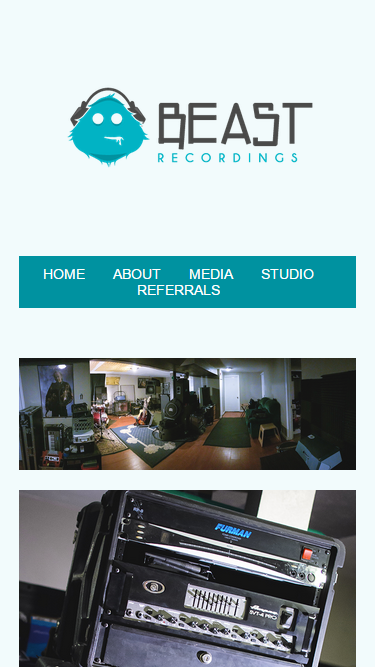
Beast Recordings | Interaction & Visual Design
When Beast Recordings approached me they were only in need of a logo, which needed to be professional and clean but also fun and inviting. After completing the logo, which got a playful 'beast' mark and custom typography, I found that the website was still in the build process and needed an extra set of hands working on it. The owner wanted full control, no maintenance package, so I created a workflow and html template that was not only responsive but easily reproducible. Check out the branding here
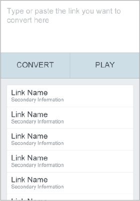
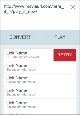
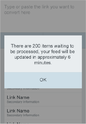
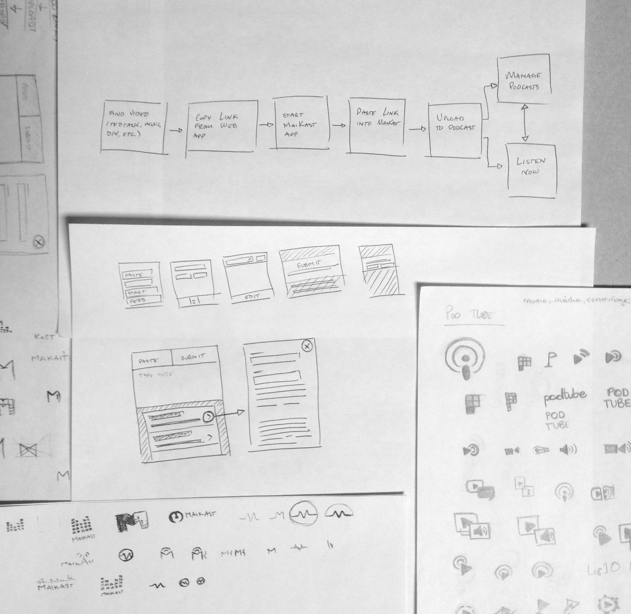
MaiKast | Interaction & Visual Design
MaiKast is an app created by individuals who love to build things they need or use. MaiKast was at the start of life when they brought me into the group. The name was in flux and a lot of the user interface was still being decided on. I assisted getting MaiKast a new identity, graphics for the various app stores, and the interface for the iOS app.Check out the branding here
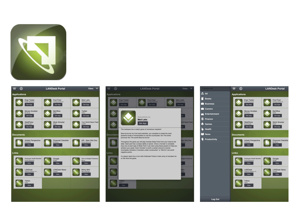
LANDesk Portal | Visual Design
While working for LANDesk Software I was also in charge of the graphical assets that the development team would need to publish this application to the app store.
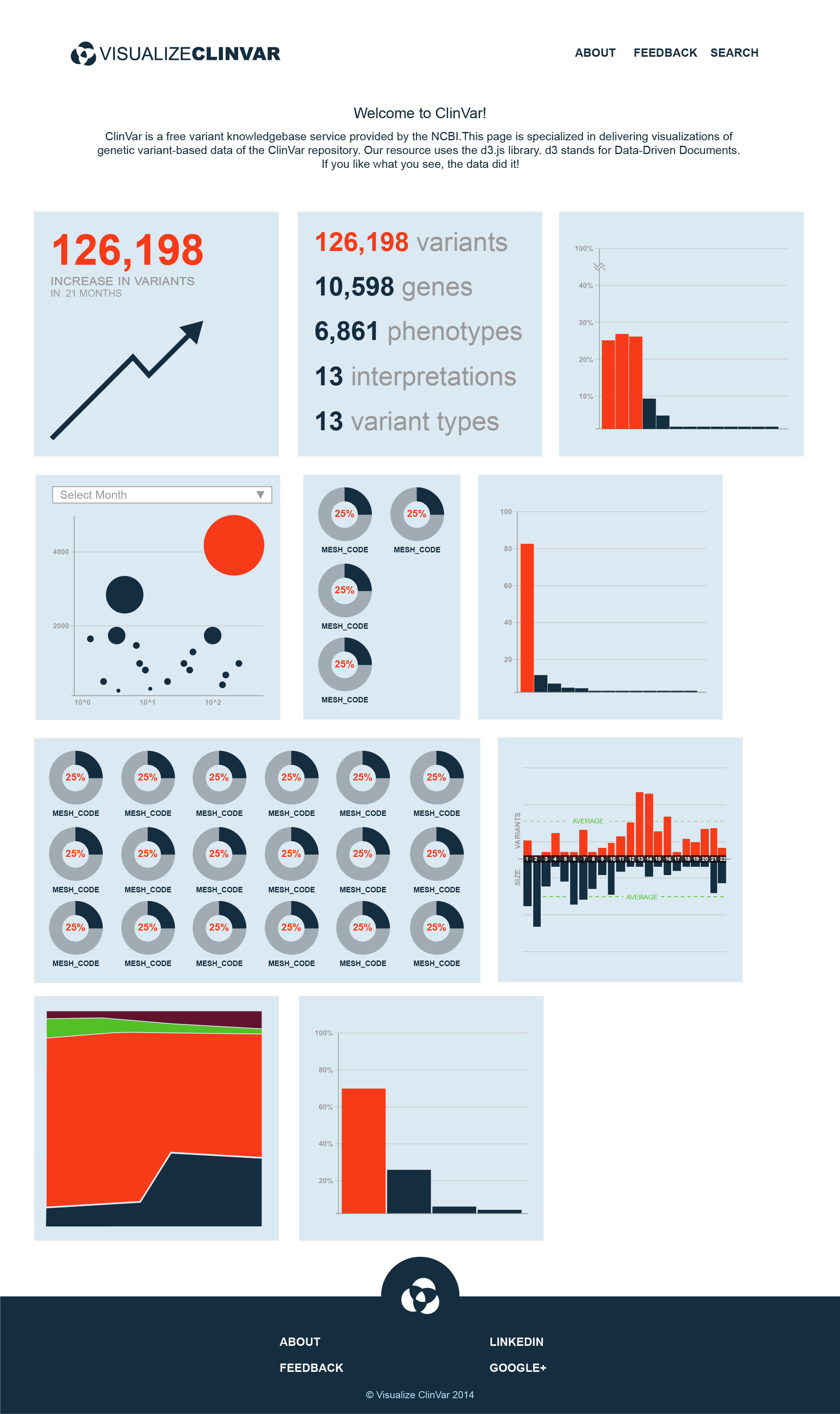
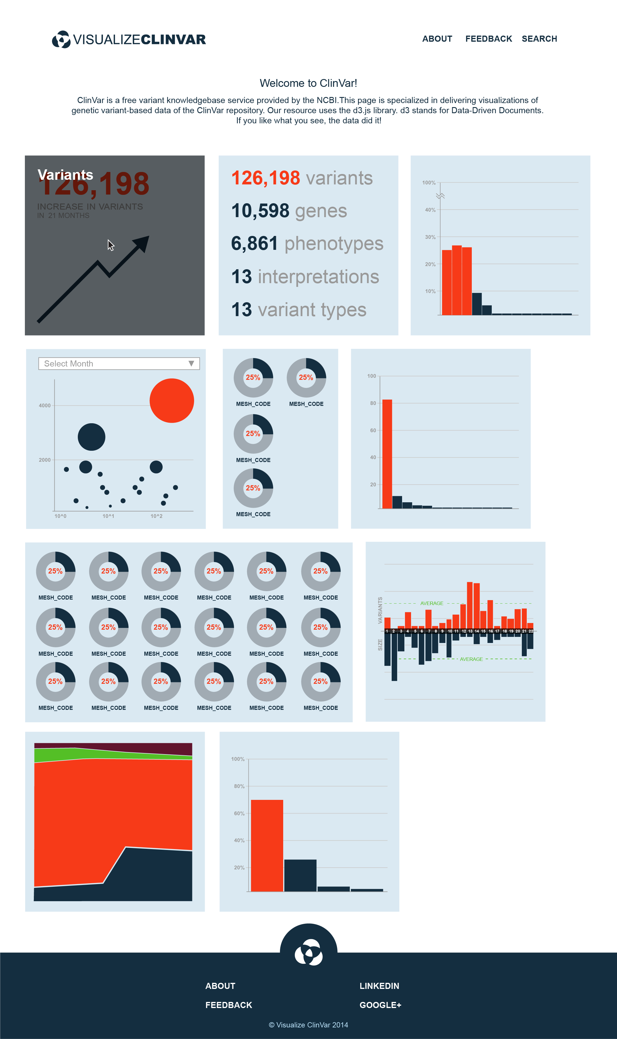
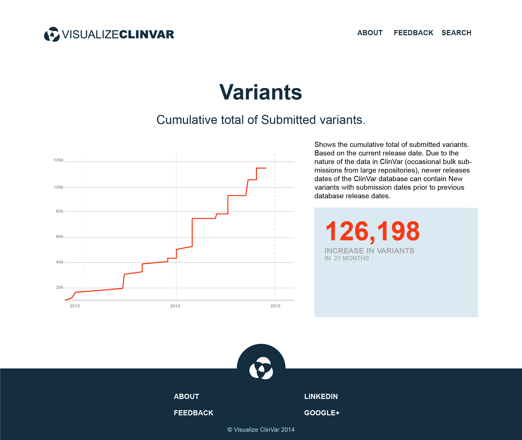
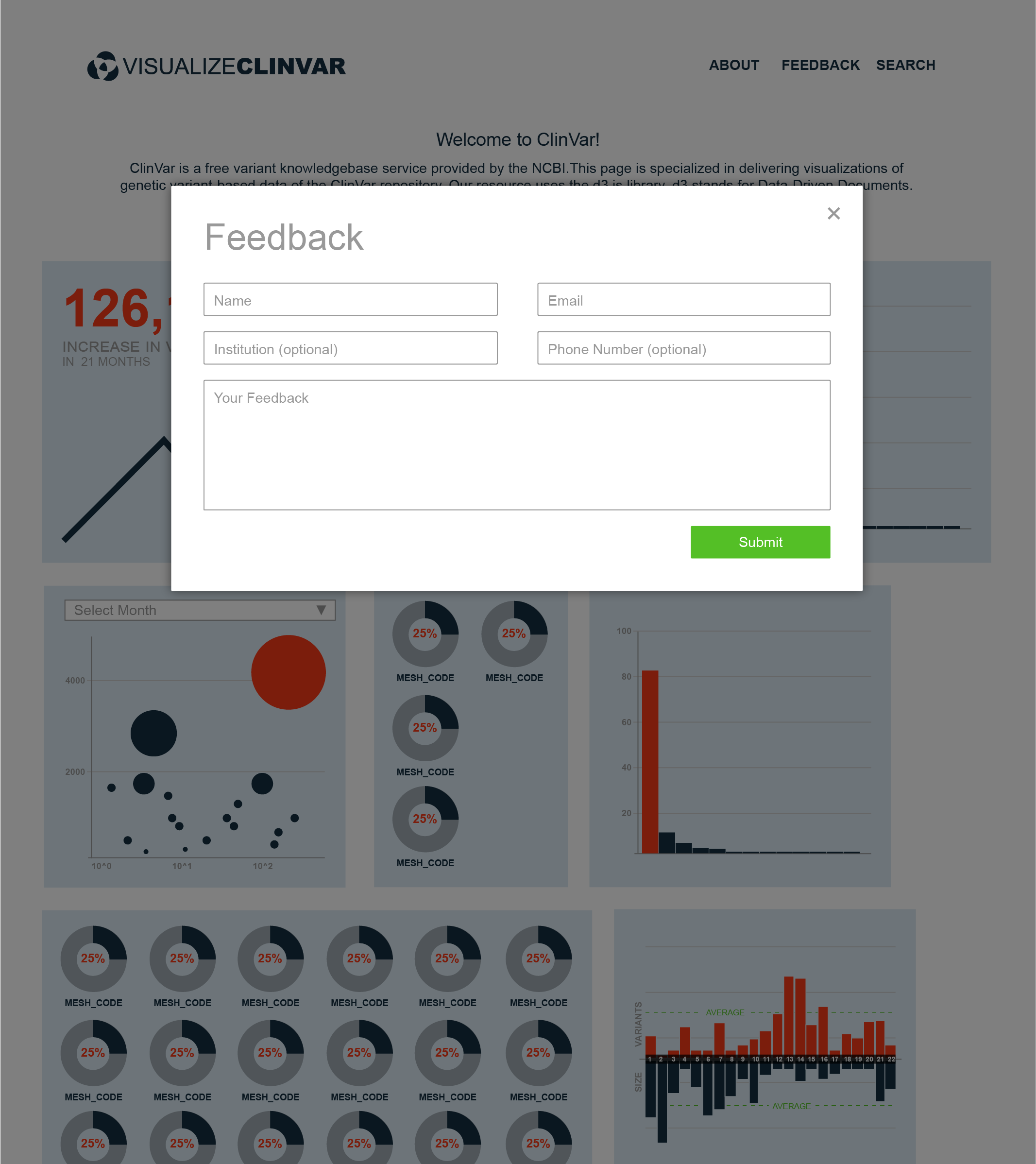
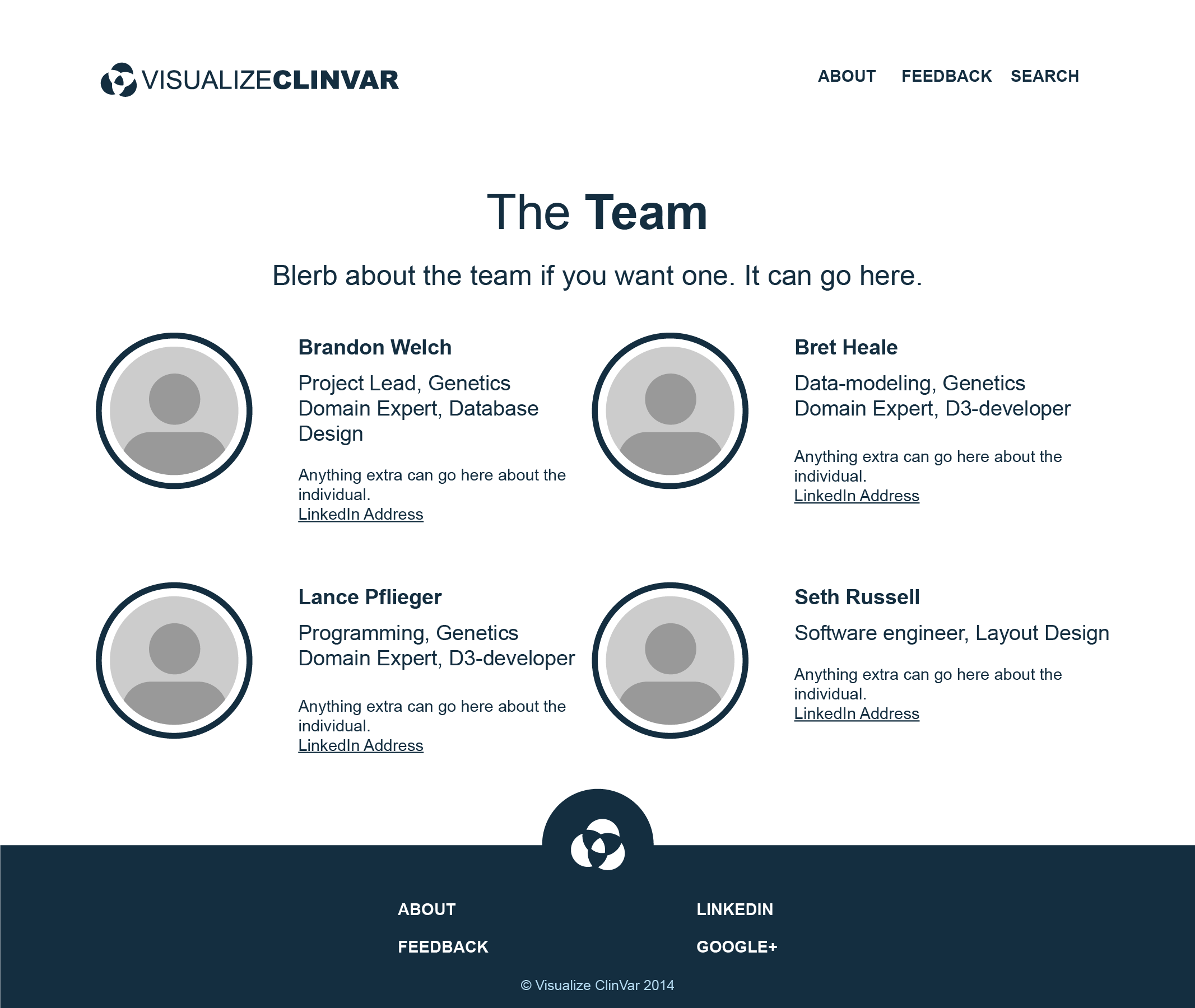
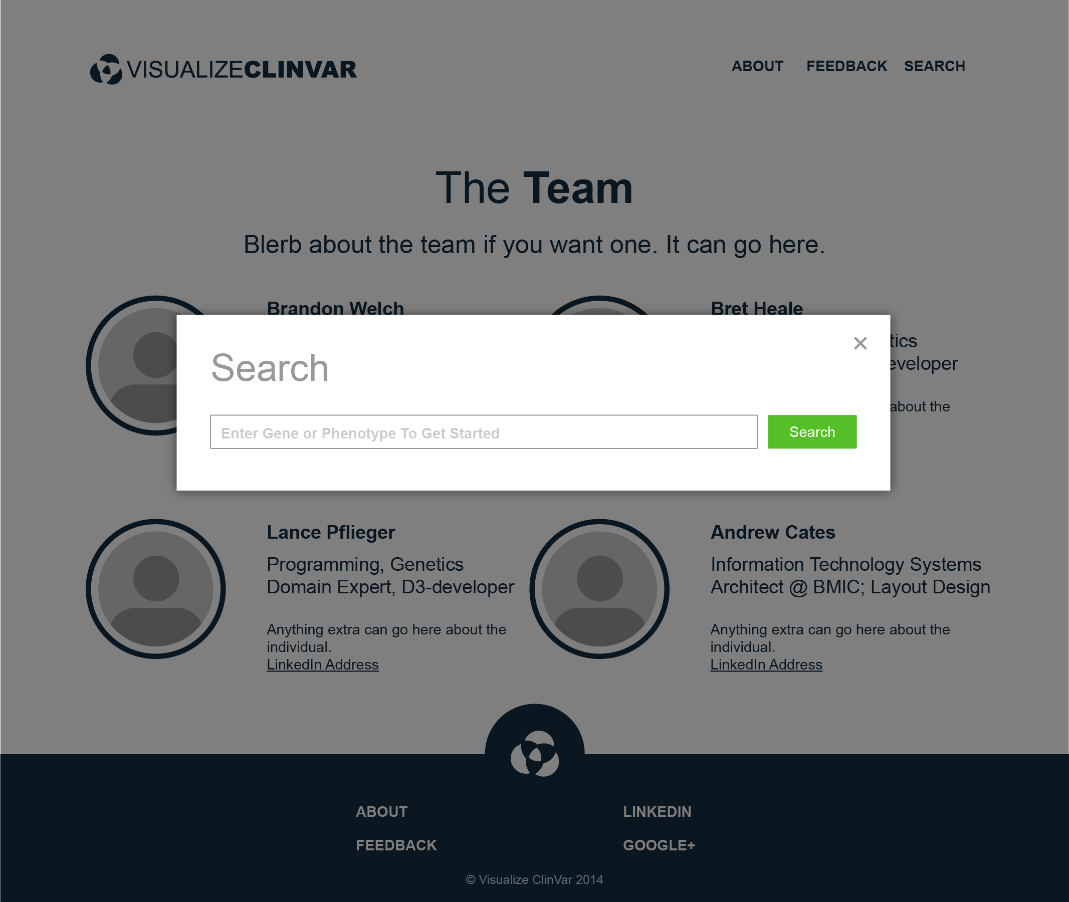
Visualize ClinVar | Interaction & Visual Design
Visualize ClinVar is a website that visualizes variants in genes from a collection of data from around the globe. They asked for my help to design the graphics and charts as well as the layout/design of the web interface. This was a fun project, where I was asked to primarily worry about the visual design, but got to practice more user experience and design for the user and what they would need to see versus what is "pretty" to see. This project also tested my ability to understand and learn a very complicated field of information.
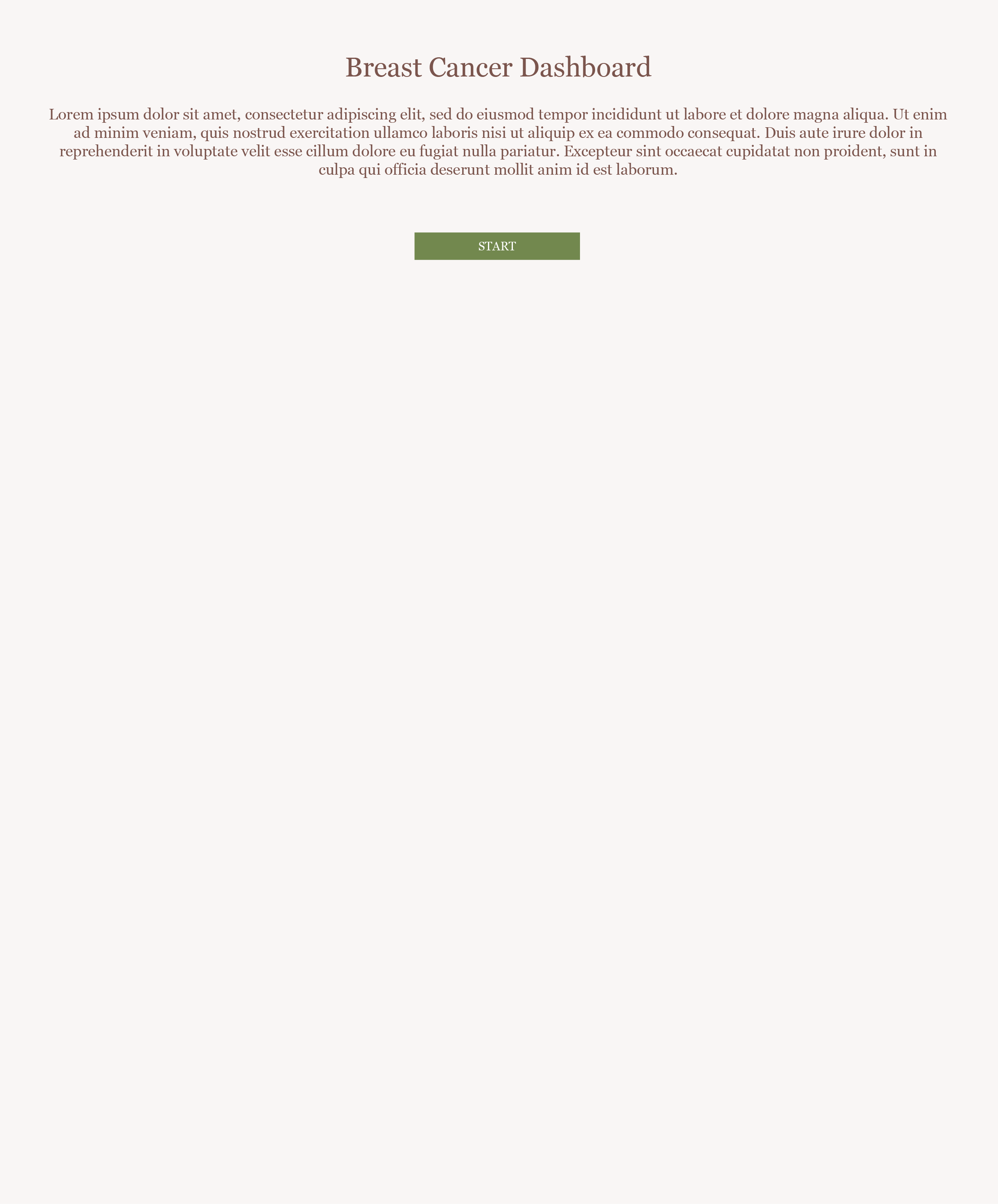
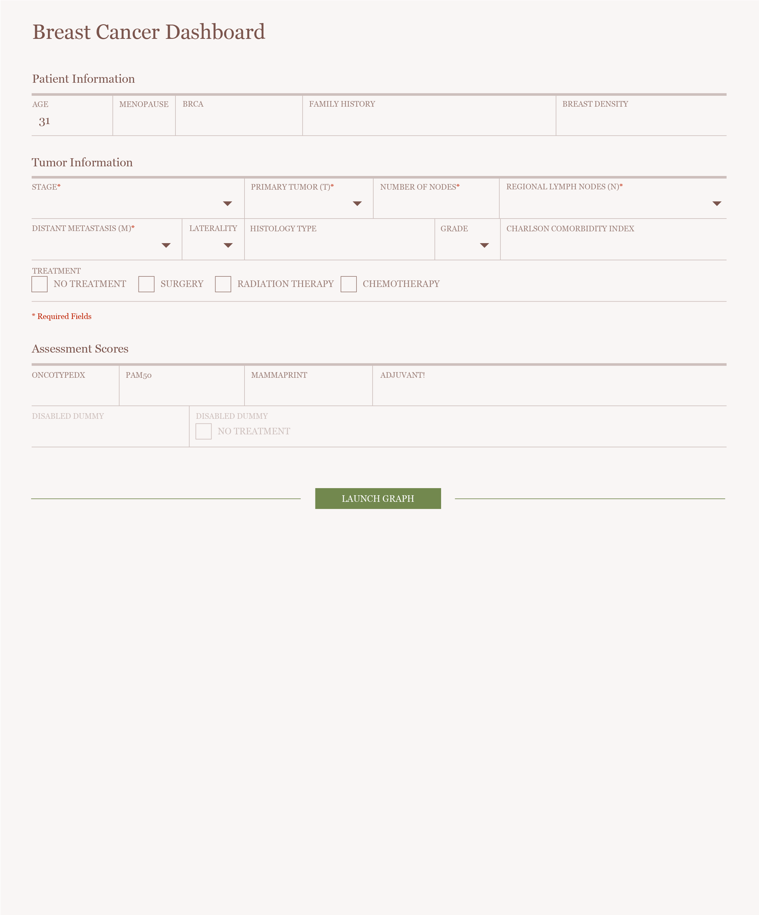
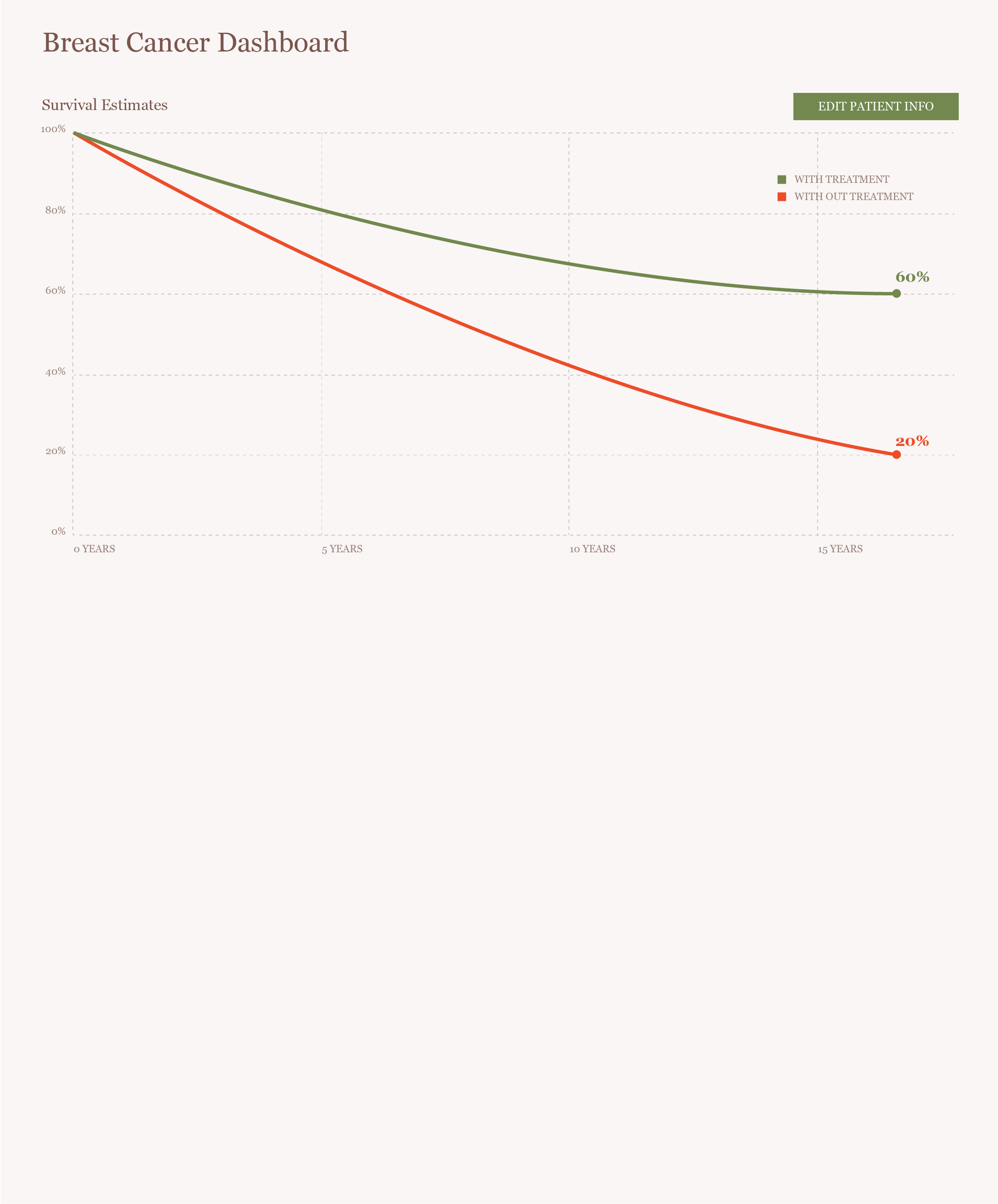
Breast Cancer Dashboard | Interaction & Web Design
A team of geniuses, as I like to call them, were building a website that could be used by doctors as well as end users who have just received information regarding their diagnosis with breast cancer. I wanted to make sure this looked professional, inviting, and was as calming for the patient as possible. I also wanted to utilize bootstrap knowing that this needed to be viewable on various difference sizes.