
iOS Accessibility Testing
Breaking ground on an accessibility testing software for iOS apps.
Overview
We tackled the beast of iOS accessibility testing. Our mission? Build a super simple, desktop solution that cuts headaches for everyone, especially those new to Xcode.
The Problem
iOS accessibility testing was a royal pain. It wasn't just hard; non-developers were taking on the task, complicating things. The setup itself was a beast. It was SDK-driven, demanding front-end and back-end savvy, along with a solid grasp of Xcode. Add Apple's super-secure model (awesome for users, but tough on us!), and we had a recipe for major frustration. All this friction became a huge barrier to effective accessibility testing.
Research
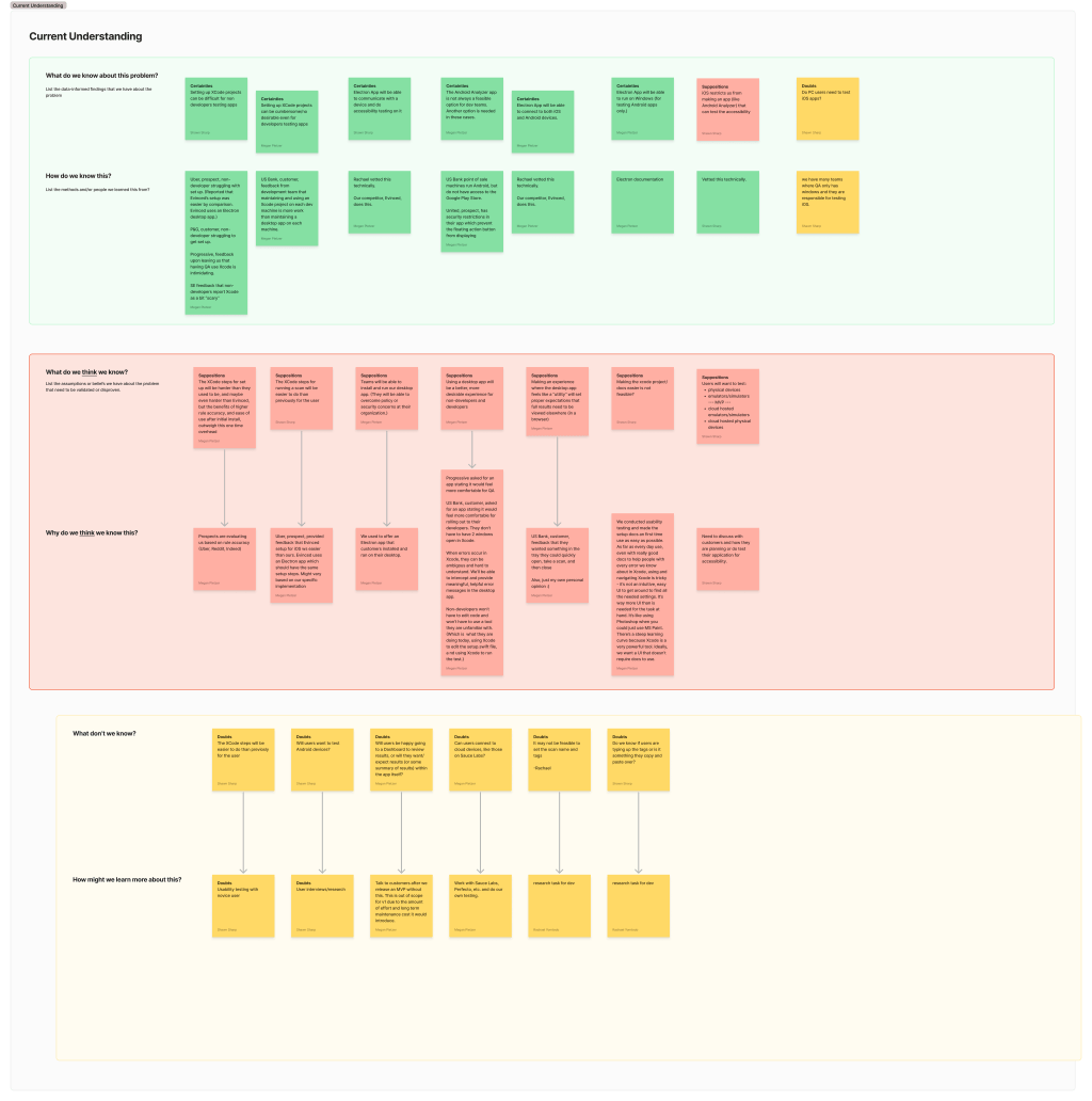
We knew guessing wouldn't cut it. So, with our mobile PM and PO, we dove deep using a Certainties, Suppositions, and Doubts (CSD) Matrix. This helped us map out what we knew, what we thought we knew, and all the spooky unknowns and risks. That was super important for avoiding biases!
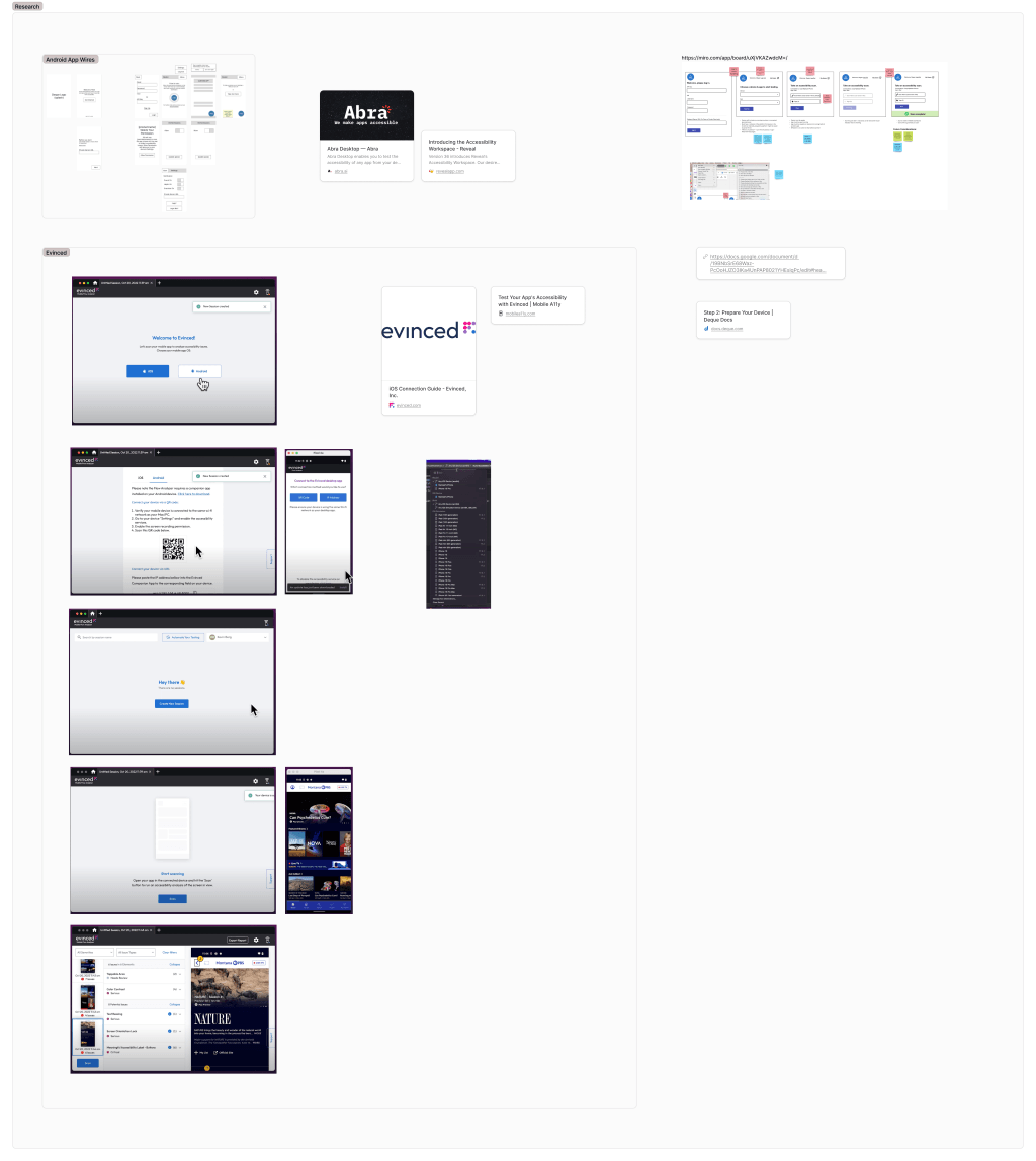
We also put on our spy hats and checked out competitors. Apple's secure infrastructure isn't just our problem; it's everyone's. We saw a mix of approaches. Some tried remote testing, others went through brutal install processes like ours, and some just threw their hands up, skipping iOS testing entirely. Crucially, we also tapped into our own knowledge, pulling insights from the Android testing app we'd released about a year prior. This gave us a real head start on understanding mobile user behaviors.
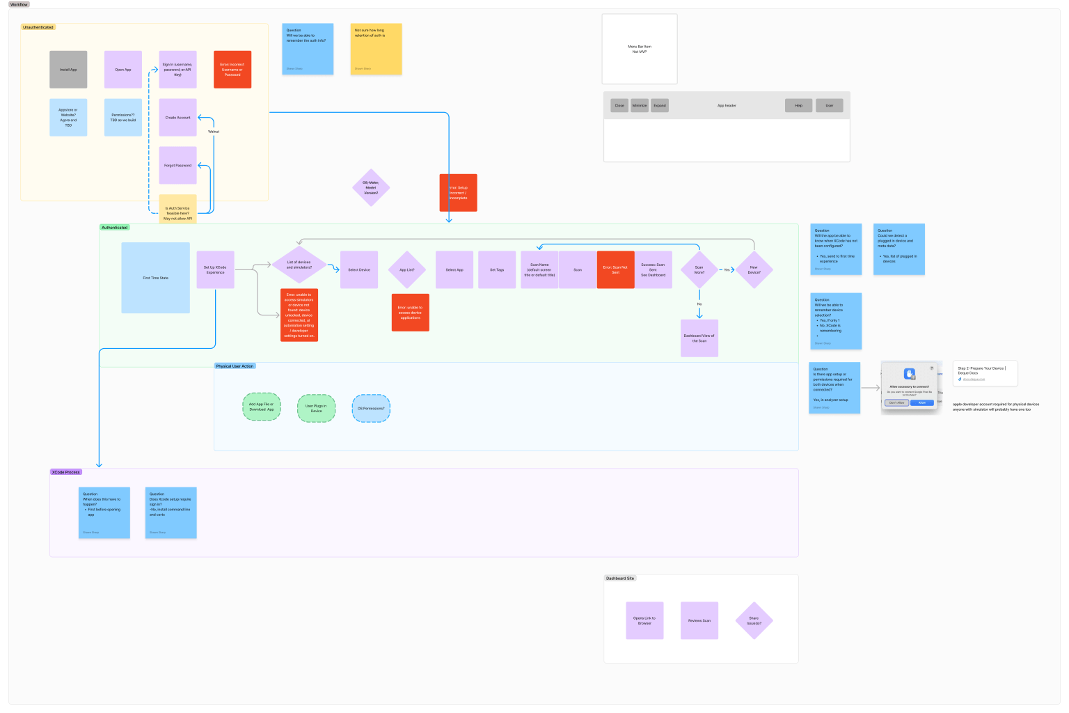
Next, we walked through the user's workflow, step-by-step, highlighting risks and opportunities. We kept asking. If Xcode setup is a nightmare, how do we make this easier? What makes a desktop app truly easier than just installing the SDK? This helped us pinpoint exactly where our solution needed to shine.
Design Solutions
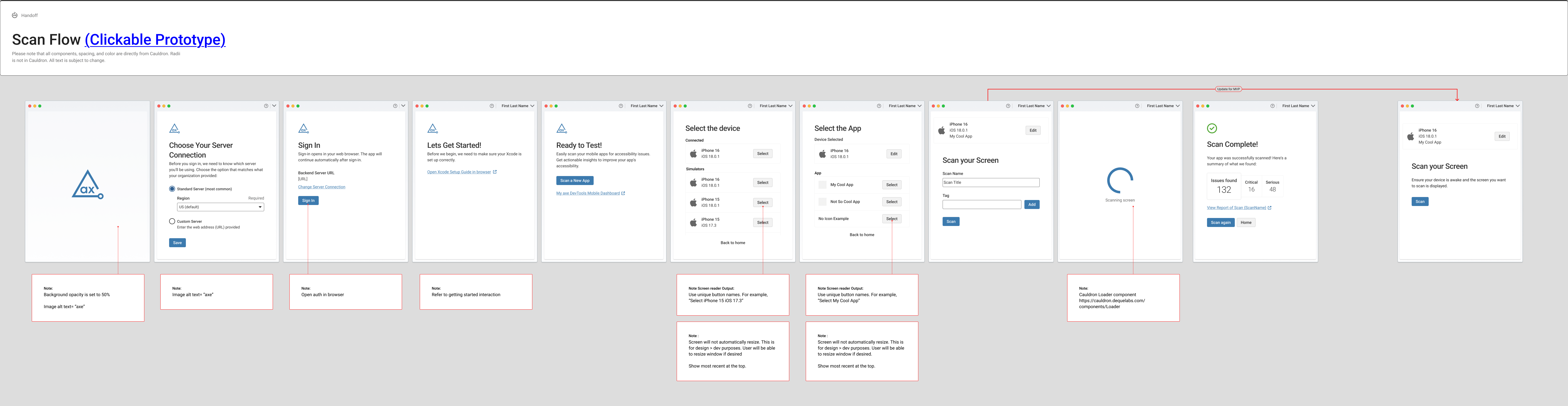
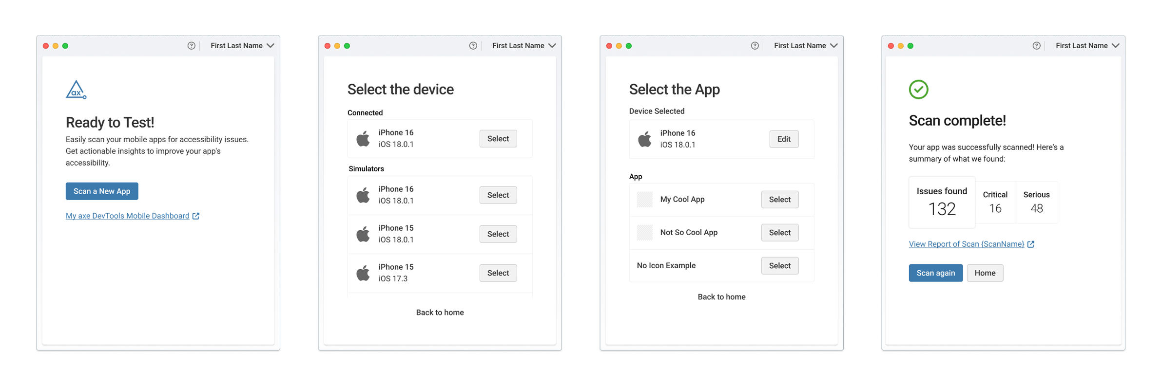
Time was a huge factor, and costly virtual machines for every user just wouldn't fly. Most folks had physical devices handy, so we needed a clever way to test those directly. The lightbulb moment was a dedicated Electron Desktop Application. This became our golden ticket, making it easier to work on Mac, playing nice with Apple's secure model, and getting users testing without a massive setup headache.
Our core design philosophy was simple: get users in as fast as humanly possible, with zero fuss. The desktop app basically gobbled up those complicated SDK setup screens, handling all the heavy lifting once installed. Even though Xcode was still part of the equation (Apple, sigh!), we slashed the 'code' down to a single line, making it way less daunting. With the desktop app now working hand-in-glove with Apple's system, those previous barriers felt much smaller.
We kicked off design with wireframes, meticulously mapping out the absolute minimum functions for each step. If a user just wanted to test one screen, what did they really need? Think: Name? Tags? Should we remember their last device choice? These questions led us to a delightfully simple, airy design. We then layered on our accessible, in-house React design components, making it look and feel like part of the Deque family. And to make sure the words felt consistent and on-brand, we even used a custom-built Claude project. This project was fed specific guidelines for accessibility, readability, and our brand voice, ensuring every piece of copy was clear, simple, and jargon-free across the whole product. Knowing the app would live in a small digital space, we embraced whitespace, inviting users in rather than overwhelming them.

Throughout this fast-paced quarter, I worked closely with the lead developer and our technically-savvy PO to hit our ambitious launch goal. We made smart calls. For instance, we avoided complex virtual environments beyond what Xcode already provided. We also decided to initially skip in-app tags (they could be applied on the dashboard later, and our Android app research hinted this was a smart 'fast-follow' move). Crucially, I teamed up directly with the lead dev to understand every possible error a user might face. This was a vital time-saver, preventing us from wasting precious dev resources on solutions for assumed errors that simply weren't going to happen.
Testing
We didn't just design in a vacuum, oh no! We put our designs (and theories) to the test right away. We ran moderated remote sessions with folks completely new to Apple's Xcode and with little accessibility testing experience. These were basically our ideal 'novice' users. We also got some early concept feedback from our initial customers, which was invaluable for shaping our direction.


Testing quickly highlighted a couple of head-scratchers. Users were a bit lost trying to find our Help link, and the Tagging feature caused real confusion. They were scratching their heads, unsure when a tag was actually applied. This feedback was gold. Our initial tag design implicitly added tags (a pattern we'd seen elsewhere), but testing confirmed it wasn't clear. The fix was delightfully simple. We just added an 'Add' button right after the text field. Boom! Usability and understanding shot way up. This direct feedback helped us iron out wrinkles, making the product feel intuitive for real people.
Did it Work?
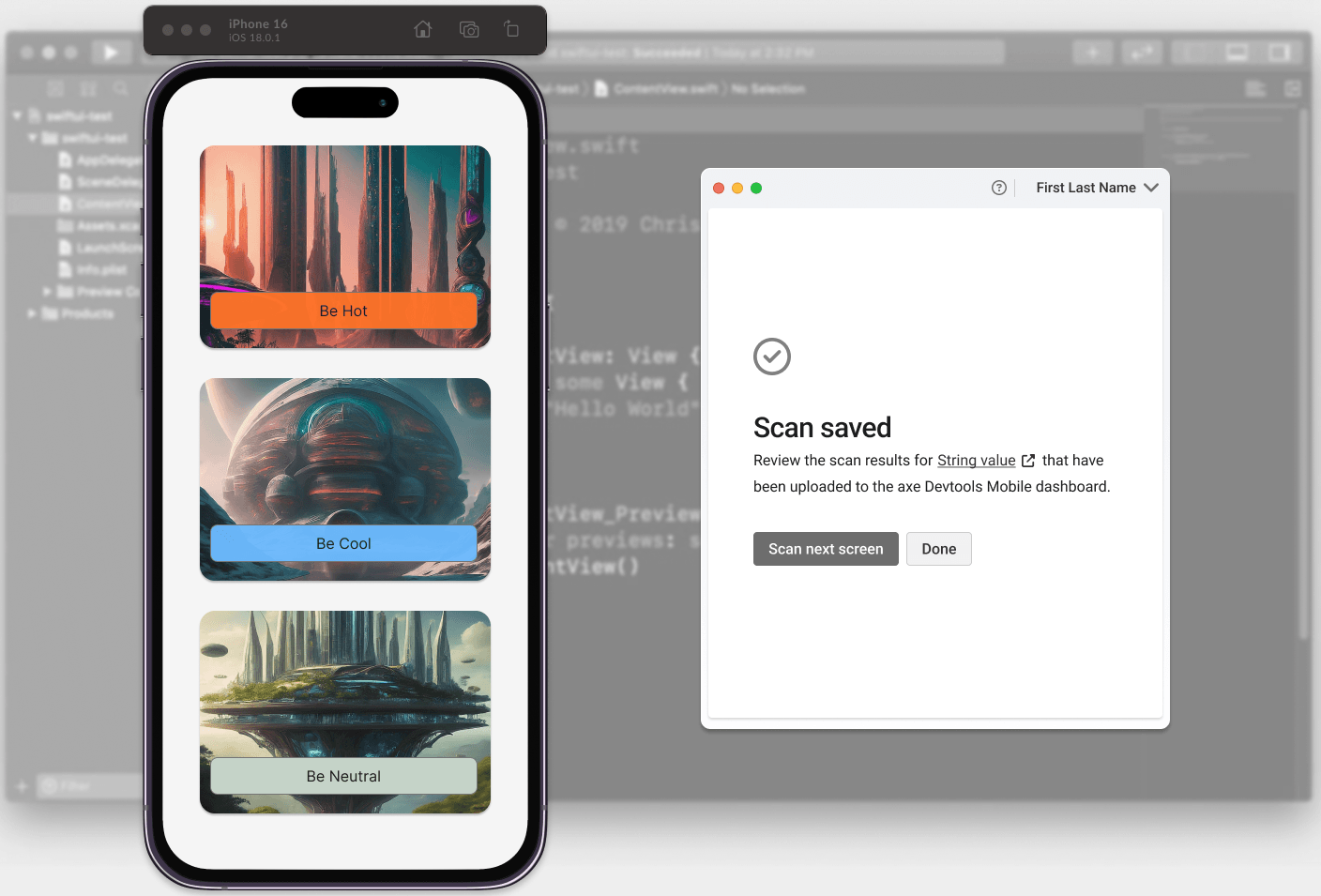
One of our biggest wins was figuring out how to show test results right there in the app. Users just wanted to know if their screen was 'clean' or had issues without jumping through hoops. Before, all they got was a generic 'success, we scanned the page.' Now, adding a simple issue count on-screen saved them a trip to the web dashboard, giving them confidence to keep scanning (test a whole flow!) or dive into details. It was a small change with a big impact on their workflow.
We also learned this desktop app could become the go-to hub for all app testing. Once we roll out Android testing here too, users will have an even bigger reason to stay in one convenient spot to test and view all results. No more app-hopping for peace of mind!
Key Learnings
- Simple Wins (Even for Complex Stuff). We saw firsthand: accessibility testing can be intuitive and look good. While developers often want endless control, simplified designs consistently prove to be real crowd-pleasers
- The 'Help' Button Paradox. Our testing showed a simple 'Help' icon's location or duplication could throw users for a loop. As one user aptly put it, "This is interesting. Because there's a need help here and there's also an like, a help button here." This is a great reminder that clarity trumps conventional placement every time.
- A 'Hub' is a Happy Place. We discovered the power of keeping users in one environment. The desktop app's potential to centralize all testing (iOS and eventually Android) means less friction and a more seamless user experience.
- User Feedback is a Gift (for Everyone!). Feedback on existing experiences didn't just improve this product; it clarified design patterns across all Deque products. It's a clear win when one project's insights improve the whole product family. Learning never stops, and we're constantly refining and anticipating more feedback as we fully release.