Filtering: harder than it looks
Going beyond surface solutions to build component-level filters that are accessible, scalable, and follow best practices.
Overview
We took on the challenge of Deque's chaotic filtering. Our big goal? Create one consistent, top-notch, and fully accessible filtering pattern for all our products.
The Problem
Imagine products dressed completely differently for the same occasion; that's how Deque's filtering looked. One product used modals, the next had scattered pills and badges. It was, frankly, a hodgepodge. Beyond the visual mess, the real problem was that it often wasn't accessible, leaving many unable to use it easily. We decided to hit this head-on. Our goal was to build the filtering pattern to rule them all, paving the way for accessibility across our entire product line.
Process
Research
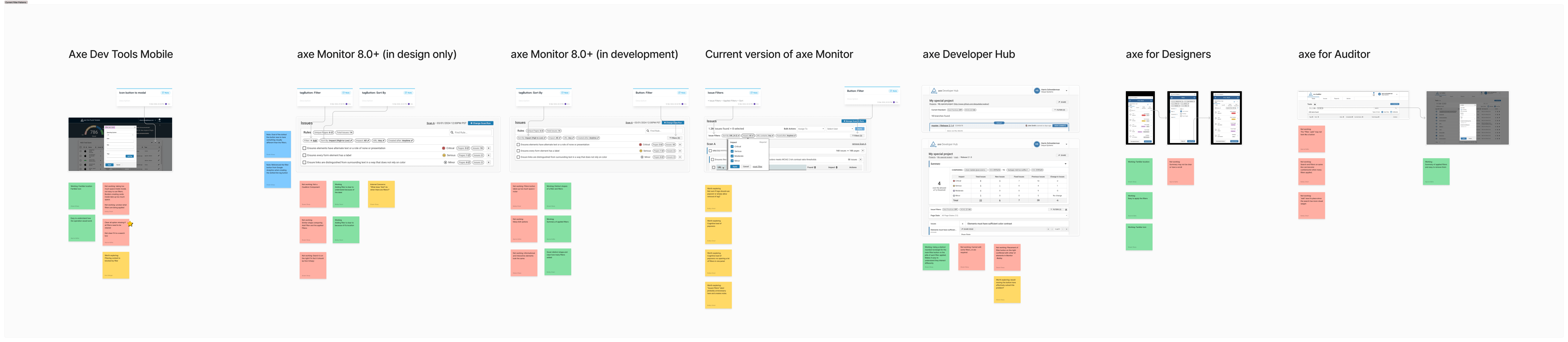
We rolled up our sleeves and got down to serious detective work. First, we tested filter icons with real users and quickly learned the classic funnel was the clear winner. Users just got it! We also conducted a thorough audit, meticulously capturing notes on filtering across all six of Deque's products to understand the existing chaos.
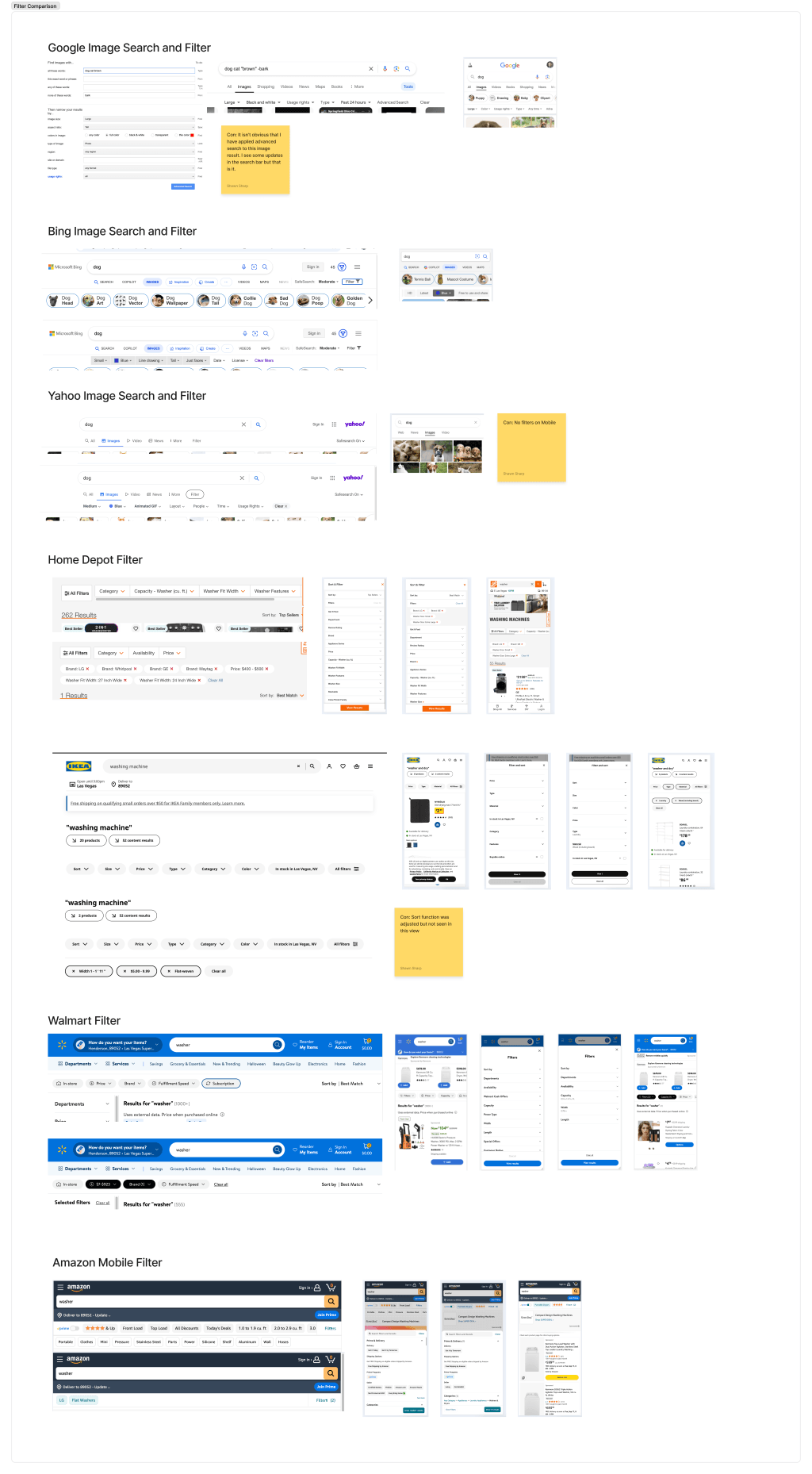
Then, we dove into the vast ocean of external wisdom. We devoured findings from Baymard, UX Planet, NNGroup, PencilandPaper.io, and SmashingMagazine. We even played "compare and contrast" with filtering from top examples like Home Depot, Ikea, and Walmart, and less ideal ones such as Yahoo, Bing, and Google. To truly understand our users' habits, we also reviewed filtering in products they live in, including GitHub, Jira, Slack, and Google Drive.
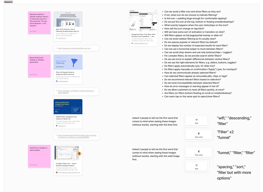
This deep dive gave us some major "Aha!" moments. The biggest was that "applied filters" are essential for our users. For single users, a reminder might feel redundant ("I just clicked blue!"), but with Deque's shared lists, displaying applied filters is critical for context and meaning for all recipients. Another eye-opener: no single company truly does filtering "great" universally! Many had inconsistencies like auto-loading on single checkboxes (leaving you wondering!), unclear next steps, or wildly changing experiences between mobile and desktop. A key discovery emerged as well. The best filtering happens when you know your content and only provide the most relevant filters upfront, tucking others into a "more" menu or flyout. Speaking of mobile, we learned "mobile" isn't just a device; it's often a viewport size. Users zooming in get that "mobile" experience.
These varied findings and industry "ahas" allowed us to leverage UX best practices. More importantly, they freed us to zero in on critical, often-ignored accessibility downfalls. This shaped crucial questions. For example, what happens on zoom? How does it announce for assistive tech? How do we support cognitive disabilities?
Design Solutions
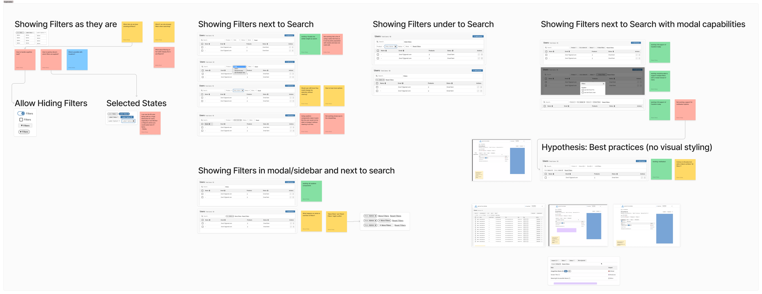
With our research complete, it was time to make some magic. I explored all possible filtering options, taking time between each wireframe set to "poke holes" and break down unknowns. I'd even workshop with others to spot sneaky red flags. This iterative process, guided by our "Aha!" that only the most relevant filters should be front and center, eventually led us to our core design.
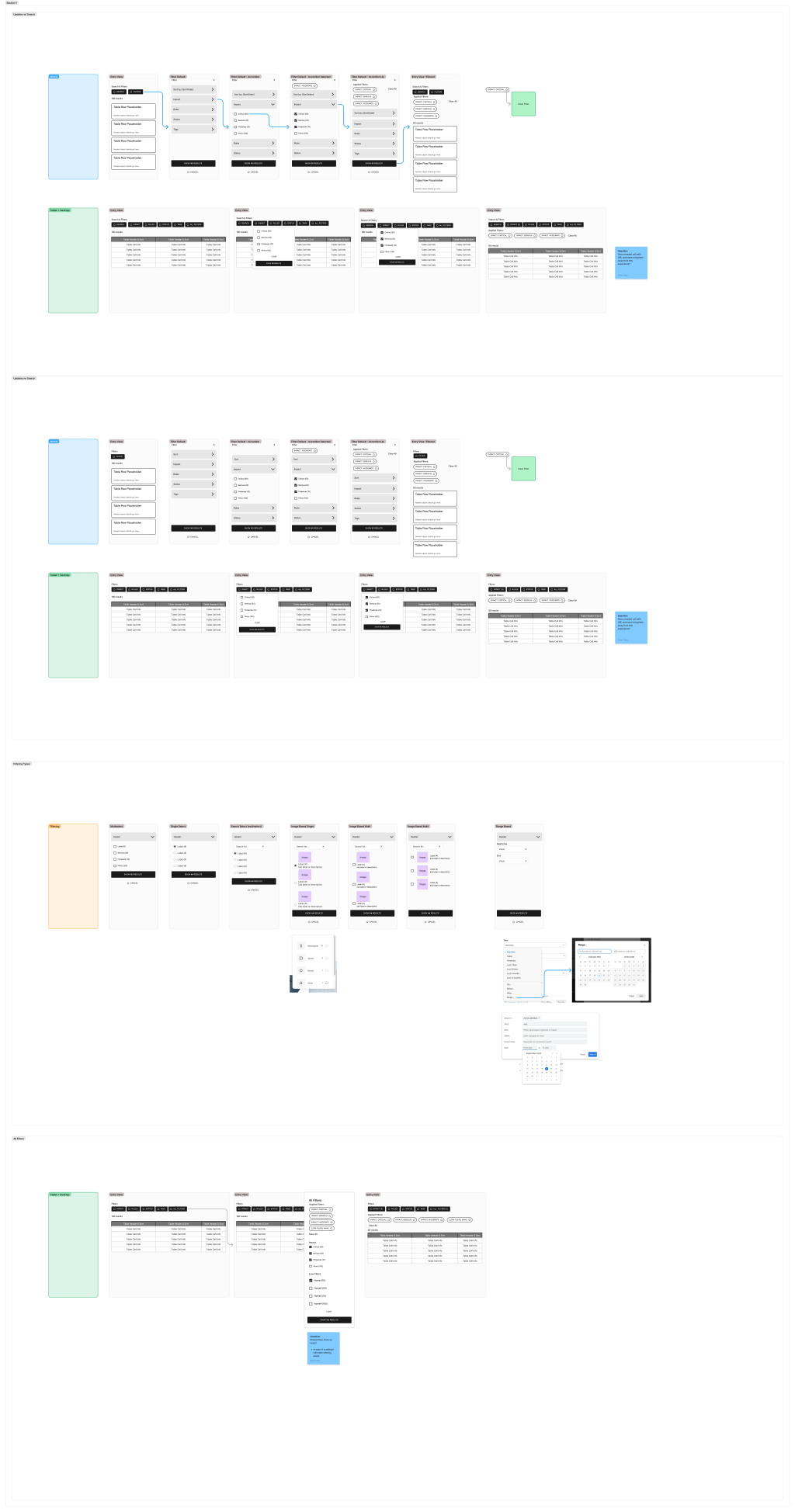
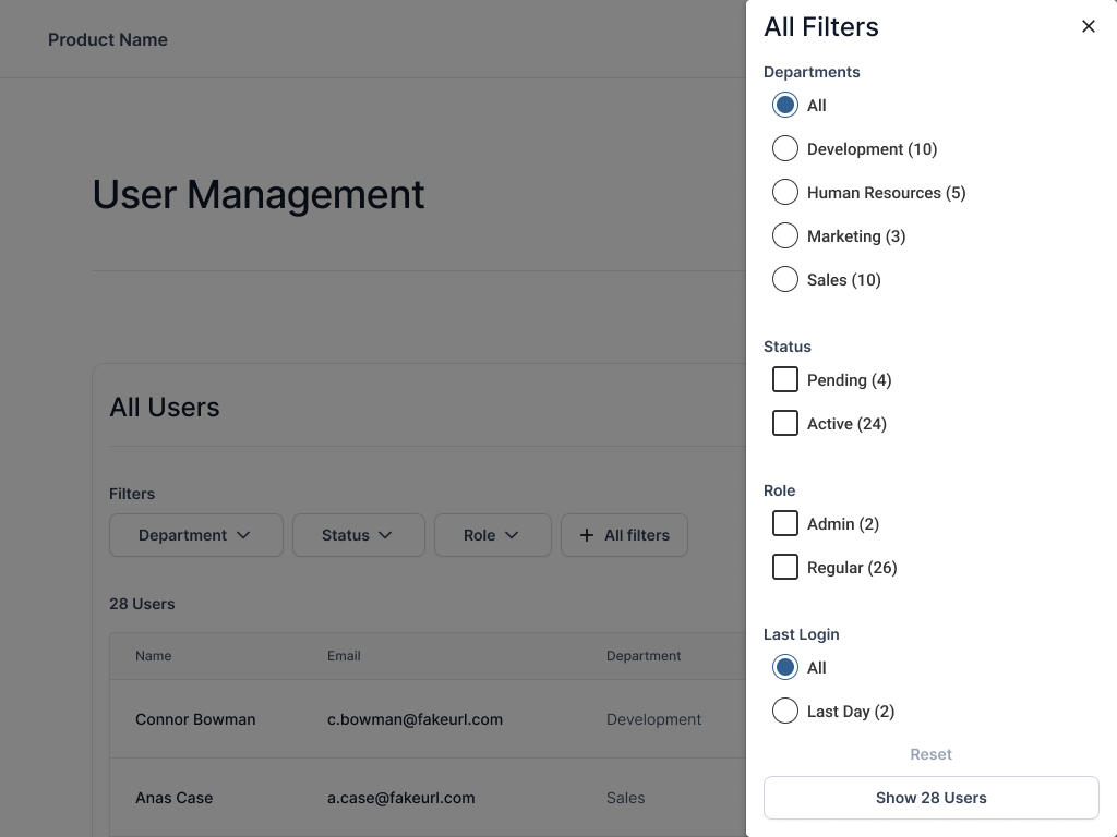
Our core design emerged with a few key pieces. We placed the most-needed filters upfront (ideally 4-5 max). For deeper dives, all filters lived in a single modal or drawer. A critical "applied filters" section clearly showed active filters, allowing users to clear all (if multiple) or remove single filters, either from this section or the main menu. We standardized the interaction hierarchy for all users and products. The order became Search, then Sort, then Filter. All filters needed to support single select (radios), multi-select (checkboxes), and range selectors.
Accessibility was baked in from day one. All controls received clear labels, differentiating "filters" from "applied filters" to avoid confusion. Filters respond fluidly. If the viewport shrinks (our "mobile is zoom state" insight!), they gracefully tuck into a menu, drawer, or modal, minimizing disruption. Crucially, every filter selection now requires an explicit action before results load. This was a direct fix for a major user pain point.
After testing these wireframe prototypes, my role shifted. I was consulted with and helped answer any questions around real content on the final design files, ensuring our vision carried through to implementation.
Testing
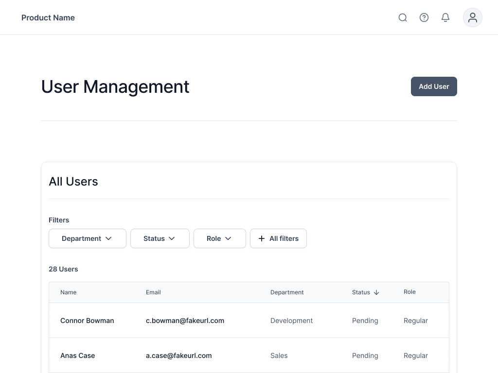
Time to put our unified filtering vision to the test. We started with a wireframe prototype, focusing on filtering in its most common format: user management. Tasks were straightforward; for example, "Find X administrators" or "Identify department with most users." We observed how long it took, if they found info, and any filter mechanism hiccups.
Initial tests revealed few earth-shattering insights, which is often a good sign after solid research! The main takeaways were that our "clear filters" button should always be enabled (never disabled), and left-aligned buttons unexpectedly improved legibility.
This wasn't a one-and-done. The lead designer and I continue to stress-test the pattern by placing it in diverse product areas. This uncovers subtle nuances, such as behavior with long rule names or URL clamping, ensuring it holds up across varied content and contexts.
Did it Work?
Currently rolling out across our product family, this unified filtering pattern is being built as a true superhero component. Our team is creating a reusable piece of magic. This lets other product teams quickly grab and use it "out of the box," only needing to finesse the data being filtered. All of this means faster, more consistent development across Deque.
While hard numbers are pending, anecdotal evidence is incredibly promising. Users perceive it as much easier, even "skimming through it so quickly without hesitation." It seems we've built something intuitive that just works.
Key Learnings
- Clarity Trumps All (Even Extra Labels). Clarity is absolutely key to our UI. Having extra labels doesn't negatively impact a user's experience. Instead, it's the lack of labeling that leaves users questioning and frustrated. When in doubt, clarify!
- The "Good Enough" Trap is Real. My biggest takeaway is that so many products fall into the trap of "good enough" filtering. Even when it makes users angry, confused, or lost, companies settle. This project proved that investing in truly great filtering is worth every effort for user satisfaction and clarity.
- Unified Design Drives Efficiency. Building one robust pattern not only helps users by making products consistent but also streamlines development, allowing teams to focus on unique features instead of reinventing the wheel.