Overview
Dell Safeguard, or just Safeguard, is like a super-smart digital vault that keeps passwords, sessions, and files locked down tight, but also easy to manage and see what's going on. Our big goal was to take three older, clunky things and mash them into one smooth, "finally makes sense" product.
The Challenge
We wanted to build something powerful but didn't require a computer science degree to use. Think "security for smart humans," not just IT wizards. Plus, it had to work great on phones and tablets, and we even had to figure out some basic rules for how Dell's desktop apps should look (who knew that wasn't a thing yet?).
Process
Research
I was the main UX brain for Safeguard, teamed up with one awesome person on the UX architecture side. Being a small but mighty team meant I got to play with everything – how it worked, how it looked, even some of the pretty pictures. To figure out what to build, we dug into the old stuff. Who used it? Who really used it? We found three main groups: regular folks, the admins in charge, and the auditors checking everything. Knowing these three helped us make sure the stuff regular folks used was super easy to find – they were our biggest crowd.
Design Solutions
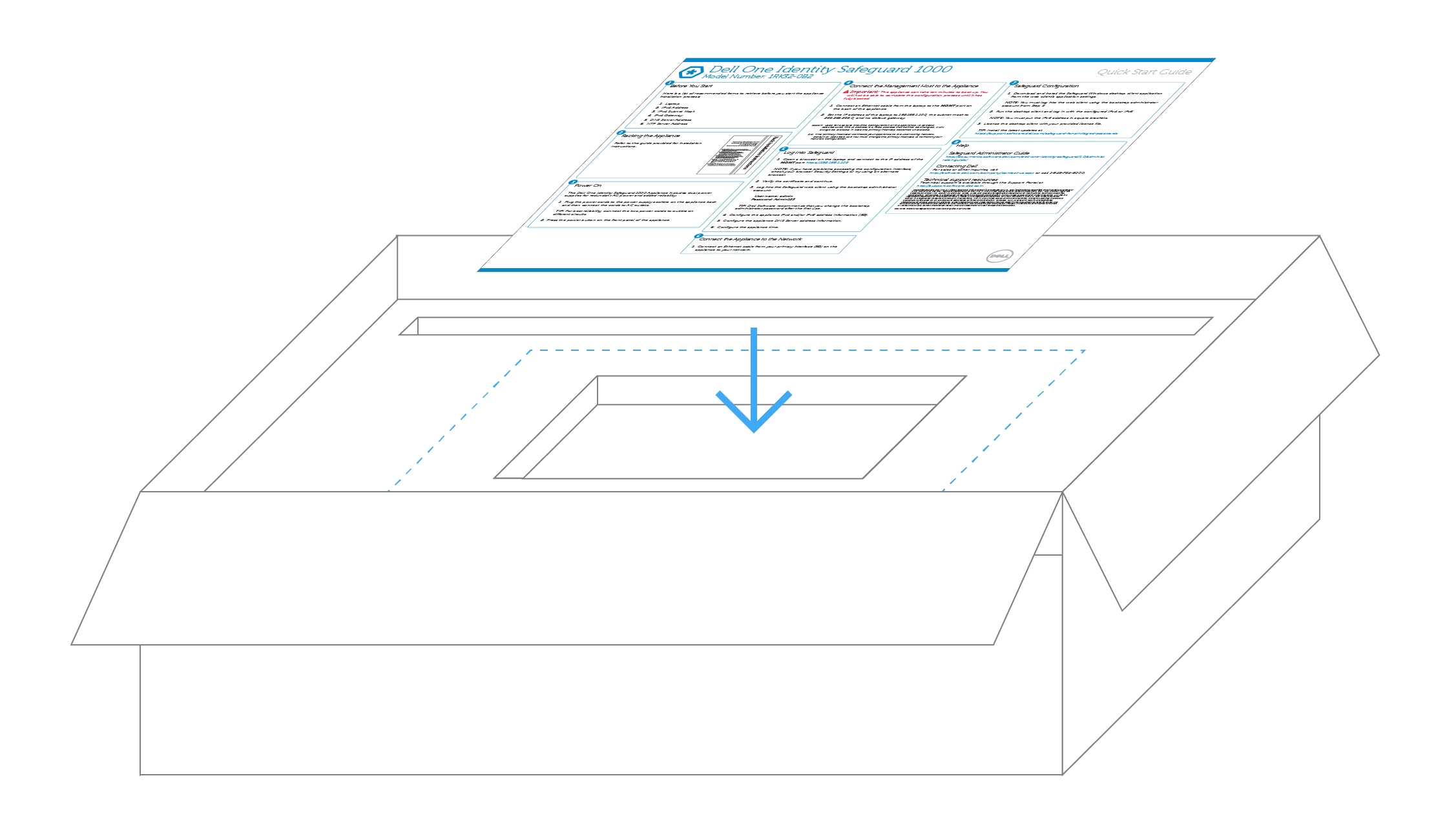
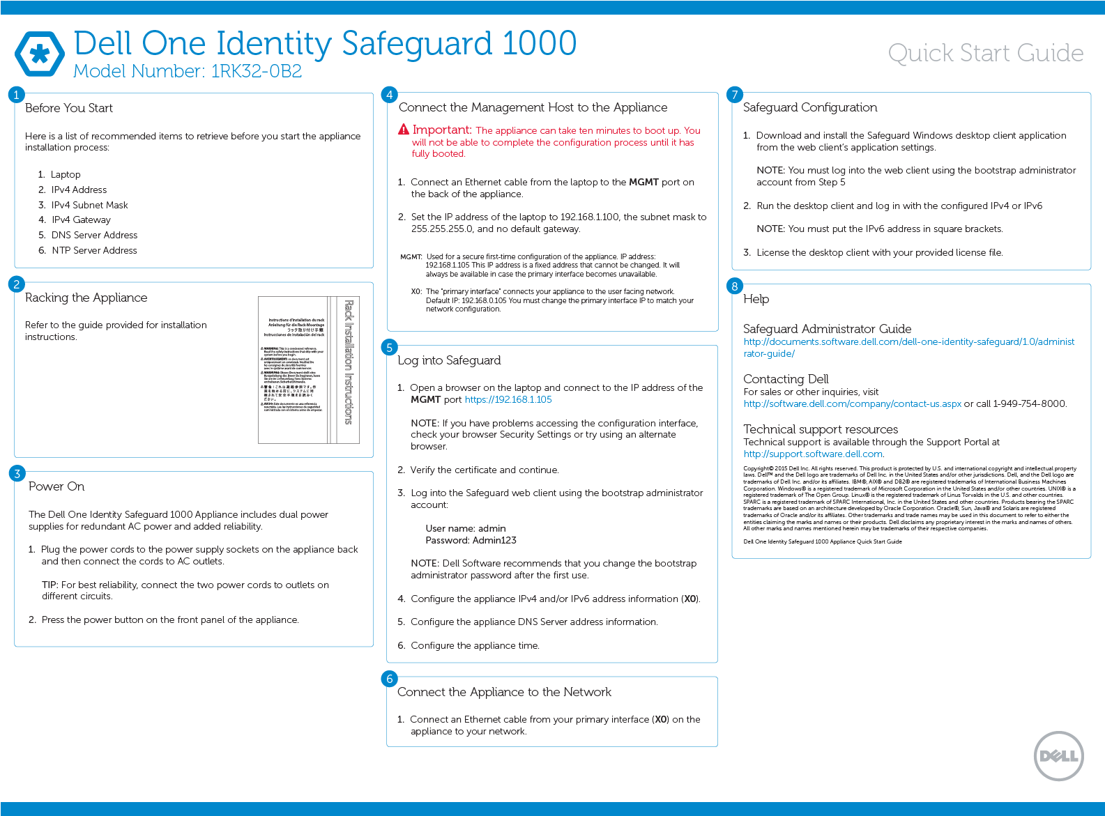
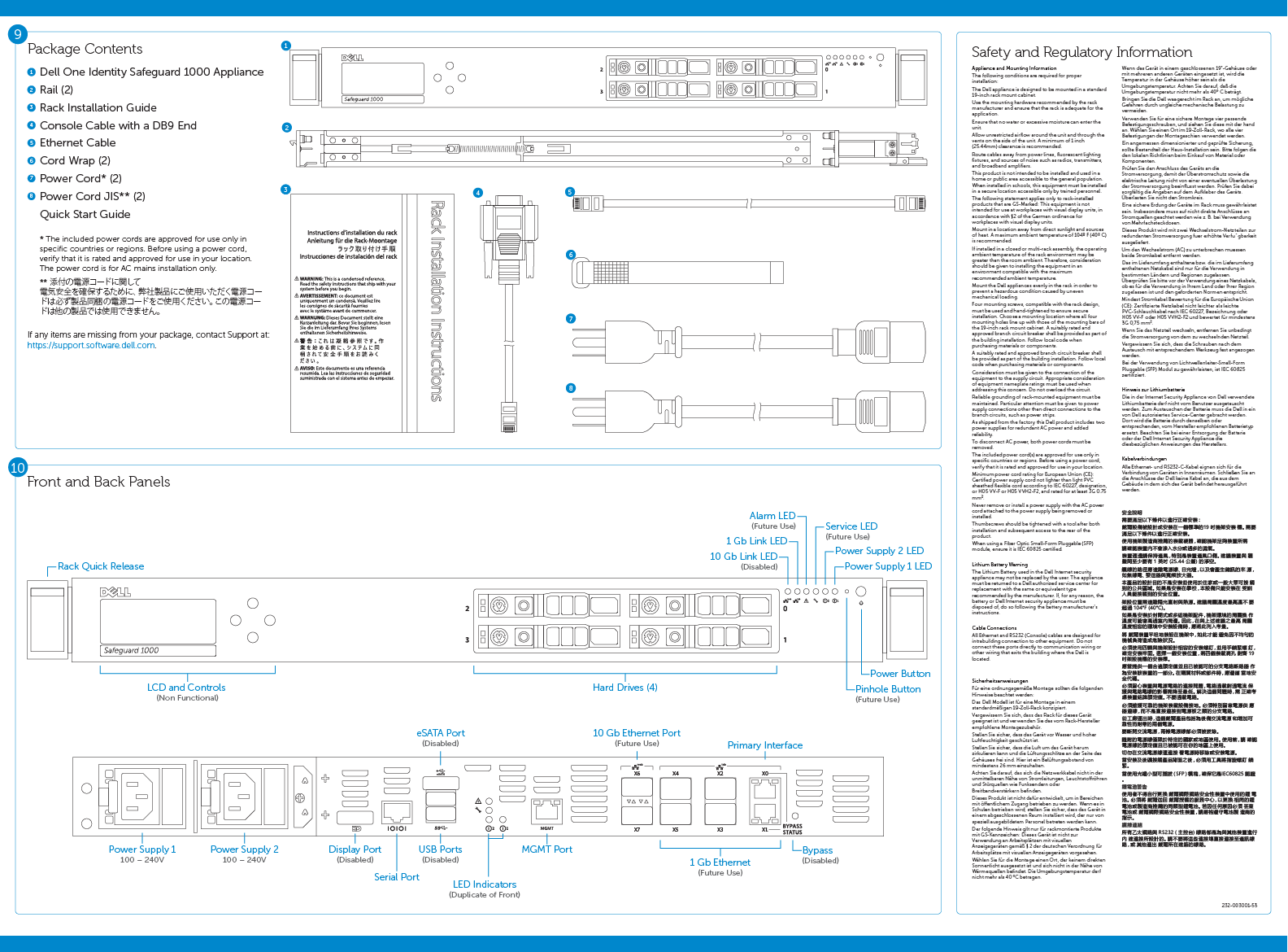
Hardware Manual Oops: The instructions for the actual hardware were this tiny pamphlet lost in the box. People just tossed it, leading to lots of "huh?". We flipped the script and made this cool 'poster' instead. Turns out, even IT pros stopped and looked at something that wasn't a boring manual. Who knew!
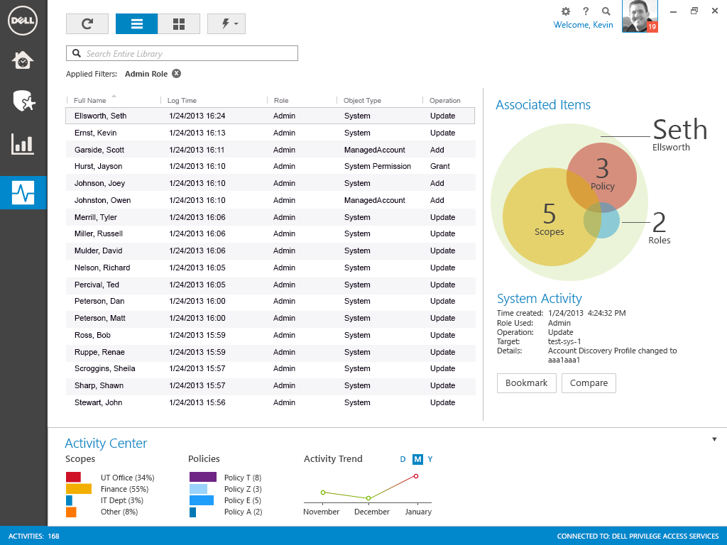
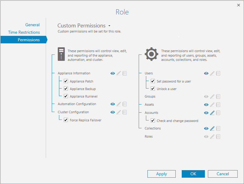
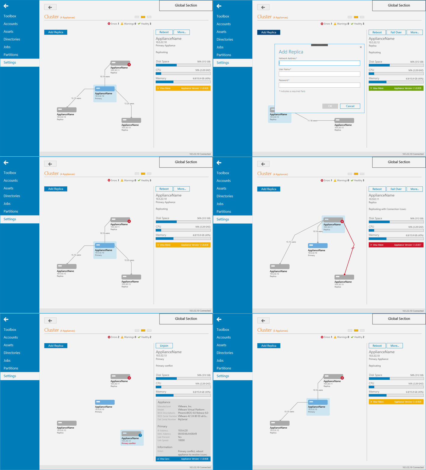
Desktop Power-Up (Simplified): The desktop app was like the control center, letting admins do all sorts of powerful stuff, from managing computers and passwords to who gets to play with those passwords. Instead of showing every single click, here's a peek at how we made some of the brain-bending parts (like permissions, system health, and activity logs) actually make sense in the final product.
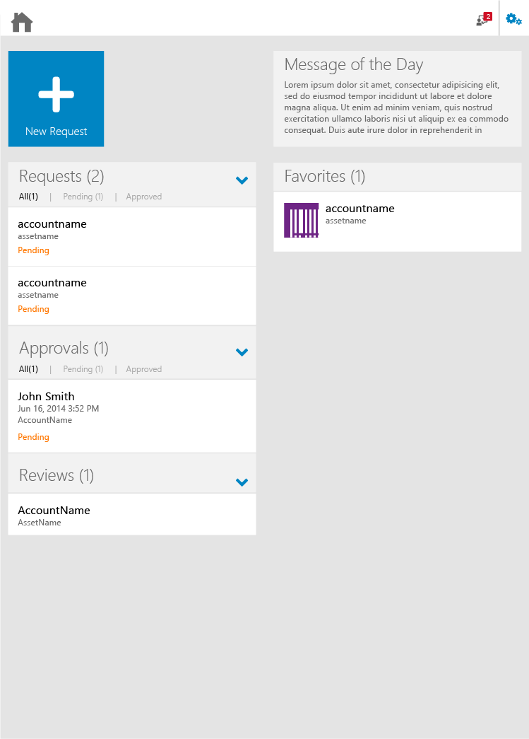
Mobile-First Magic (Web Experience): We knew the web part needed to play nice with phones first, then scale up for bigger screens. So, no matter what gadget you were using, the info would always be easy to see and use. Here’s a glimpse of what someone who approves things would see – clean and simple, no matter the screen size.
Usability Testing
WWe didn't just guess this stuff would work – we hit the road! We took Dell Safeguard to real customers, from schools like Alpine School District to the workwear folks at Carhartt. We watched them install it, like hawks, noting every "huh?" moment in the guide and on the screen. Since this thing was pretty deep in their systems, we even let their IT gurus take it for a spin for a few days, basically saying, "Go break it, tell us what's clunky."
But we didn't just talk to the techy folks. We also grabbed regular people off the street (okay, maybe not literally, but you get the idea) to try out the features. We wanted to make darn sure it was something anyone could use without their brain melting. Lastly, we zoomed over to our support and solutions crew in London for a crash course. They used it like crazy and gave us the lowdown on what confused them and what could be better. All this helped us make sure Safeguard wasn't just secure, but actually usable by everyone.
Did it Work?
By making things easier to understand from the get-go (that poster!), and by simplifying even the complex admin tools for desktop and making the web stuff work on any device, we aimed to create a security product that was actually… usable.
Key Learnings
- A little thought on something as basic as a hardware guide can make a huge difference in the initial user experience.
- In today's world, your web stuff has to work well on any screen size – no excuses.
- Understanding the different types of users (end-user, admin, auditor) helps you prioritize and design the right experiences for each.
