
Filtering: built right not copied
Going beyond surface solutions to build component-level filters that are accessible, scalable, and follow best practices.
The problem
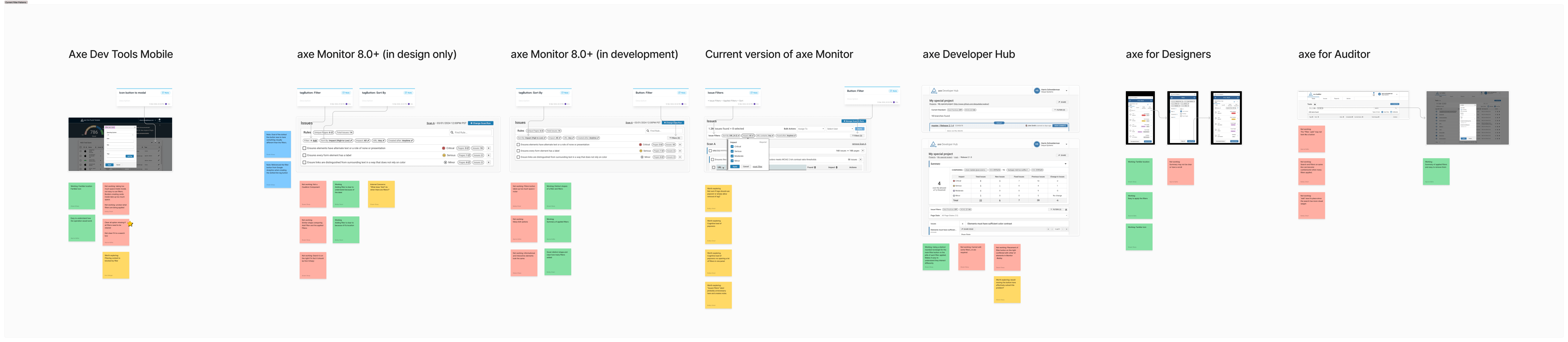
Deque had six products with six different filtering implementations, and none of them met accessibility standards.
One product used modals. Another scattered pills and badges across the interface. A third had no filtering at all. Beyond visual inconsistency, the real crisis was accessibility. Industry research confirmed what our audits revealed: most filtering is not accessible, leaving users with disabilities unable to effectively use these core features.
This was not just a design problem. It was a credibility problem. We needed to build a unified, accessible filtering pattern that would work across all products and set a new standard for the industry.
The solution
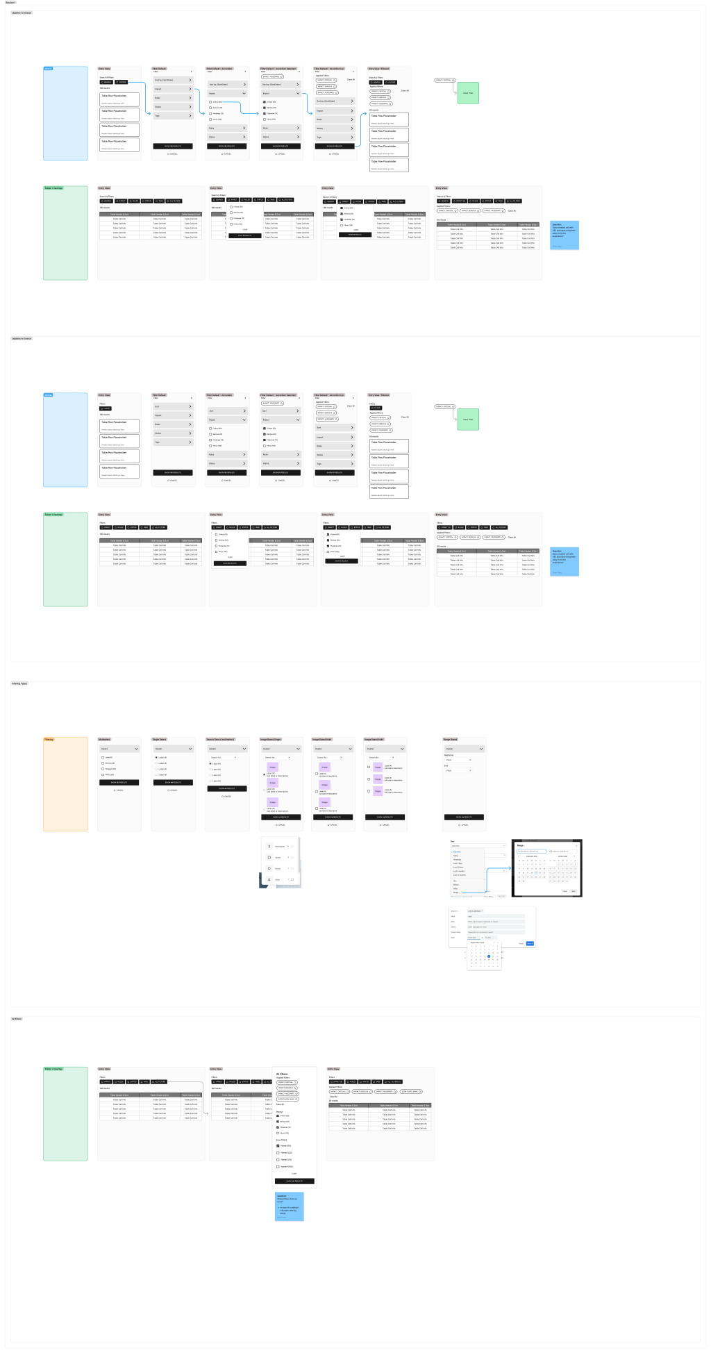
We created a single, reusable filtering component built on accessibility best practices and comprehensive UX research. The pattern consolidated scattered approaches into one system that adapts to any product context while maintaining consistent interaction patterns and full accessibility compliance.
Key innovations:
- Labels, like “applied filers” are always visible with filters for shared data context (critical for team collaboration)
- Explicit user action required before results load (eliminates confusion and supports cognitive, and assistive technology accessibility)
- Responsive design treating zoom states as mobile viewports (serves both mobile users and accessibility needs)
- Consistent interaction hierarchy: Search, Sort, Filter across all products
- Used a custom Claude content project to unify our language across products and projects
The impact:
- One reusable component replaces six inconsistent implementations
- Faster development across product teams (grab and use out of the box)
- Full accessibility compliance throughout the filtering experience
- Users report the new pattern is "much easier" and they navigate "without hesitation"
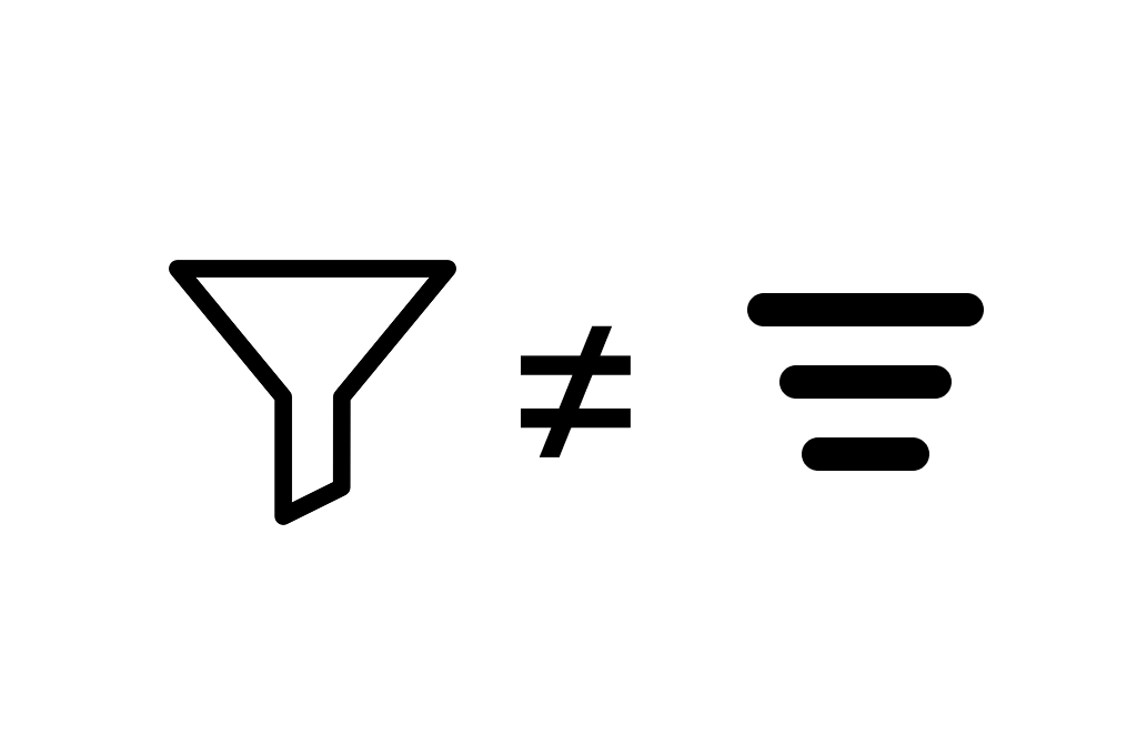
- Use of the funnel icon increased comprehension versus using the three line icon. Trending does not mean it will be known.
My role
I led the research, discovery, and interaction design to unify filtering across all products, including the creation of core prototypes for final designs. I worked closely with the lead designer to stress-test the pattern across diverse product contexts and collaborated with development teams on implementation specifications.
Tools: Figma, FigJam, Baymard Research, Custom Claude Project, Moderated User Testing
How we got here
Research: understanding the problem
We started by testing filter icons with real users. The classic funnel icon was the clear winner. Users immediately understood its meaning. Next, we conducted a comprehensive audit across all six Deque products, documenting how each one handled filtering.
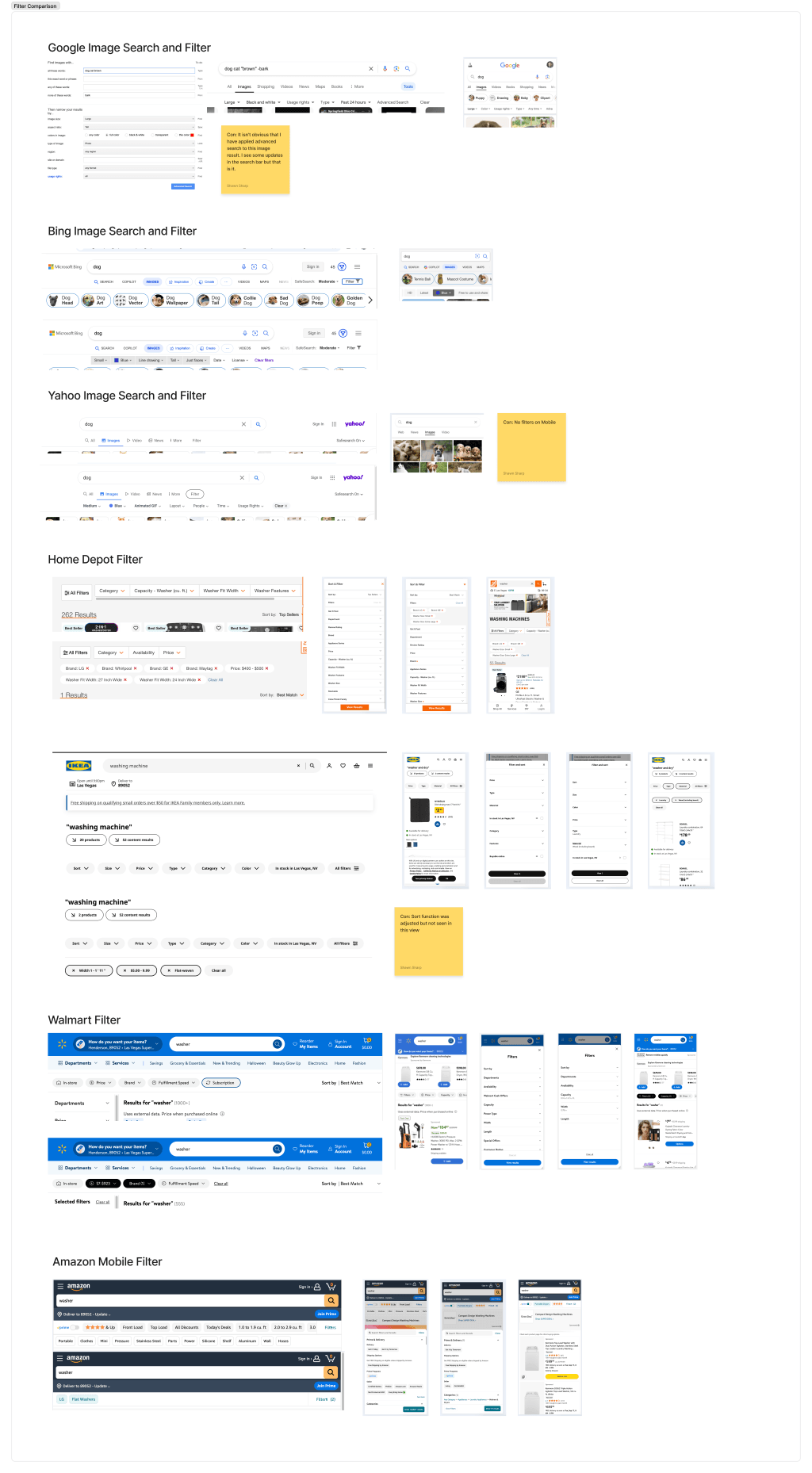
We analyzed findings from Baymard, Nielsen Norman Group, and other UX research sources. We studied filtering implementations from Home Depot, IKEA, Walmart, Yahoo, Bing, and Google. We also examined products our users work in daily: GitHub, Jira, Slack, and Google Drive.
Key research insights:
Applied filters are essential for shared contexts. Deque products feature shared lists where multiple team members view the same data. Displaying applied filters provides critical context about what everyone is seeing.
No company does filtering perfectly. Even industry leaders have inconsistencies: auto-loading on single checkbox selections (leaving users confused about what triggered the change), unclear next steps after selections, and wildly different experiences between mobile and desktop.
The best filtering is contextual. Successful implementations show only the most relevant filters upfront, tucking secondary options into a menu or flyout.
Mobile is a viewport size, not just a device. Users who zoom in get a mobile-like experience regardless of device. This insight shaped our responsive approach.
Design strategy: building the pattern
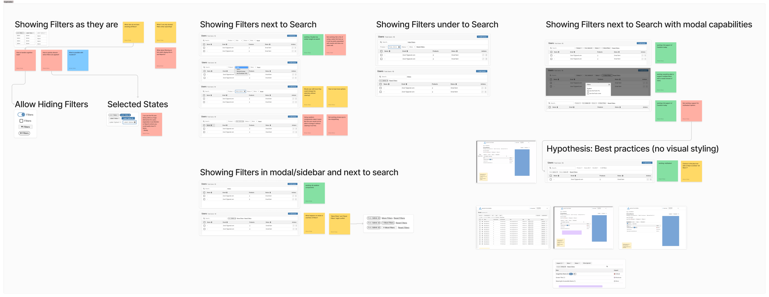
I explored multiple filtering approaches, deliberately poking holes in each iteration and workshopping with team members to identify issues before they became problems.
Our core design principles:
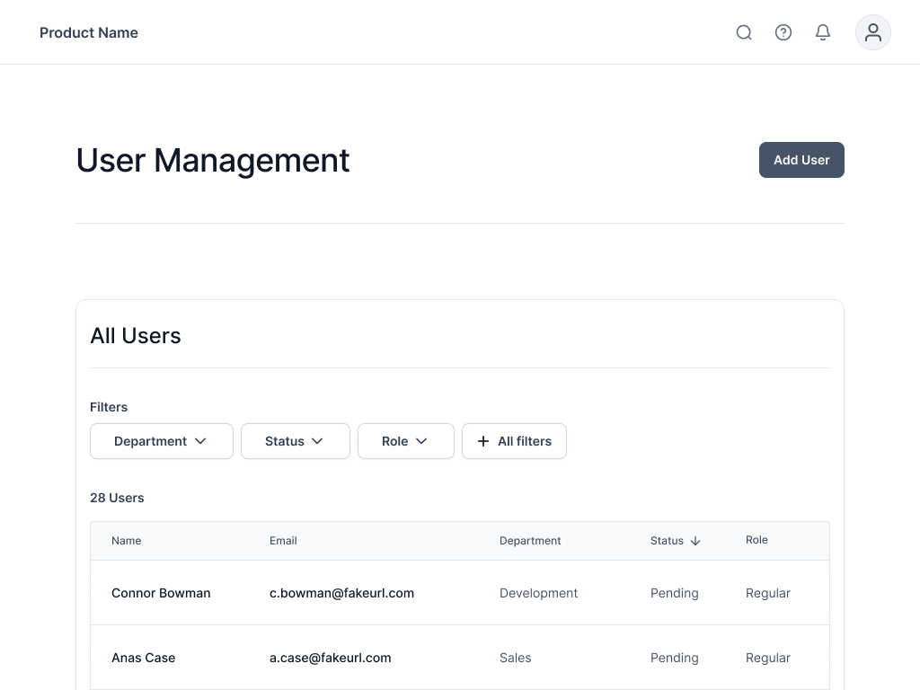
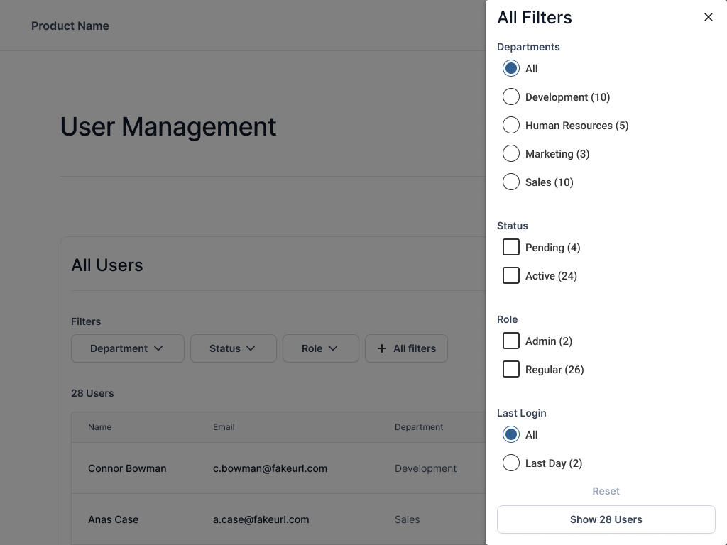
Place the most essential filters (4 to 5 maximum) upfront. All other filters live in a single modal or drawer. A dedicated applied filters section shows active selections, allowing users to clear all filters at once or remove individual selections. We standardized the interaction hierarchy across all products: Search, then Sort, then Filter.
Accessibility was foundational. All controls received clear, descriptive labels. We differentiated "filters" from "applied filters" to eliminate confusion for screen reader users. Filters respond fluidly to viewport changes. When the viewport shrinks, filters gracefully tuck into a menu, drawer, or modal without disrupting workflow.
Most critically, every filter selection now requires explicit user action before results load. This solves a major accessibility and usability problem: users maintain control over when content updates, supporting both cognitive accessibility needs and general user confidence.
Testing and iteration
We tested wireframe prototypes using realistic tasks: "Find administrators in the development department" or "Identify which department has the most active users." Initial testing revealed minimal issues, confirming our research foundation was solid.
The main insights were tactical: the "clear filters" button should always remain enabled, and left-aligned buttons improved legibility. The lead designer and I continue stress-testing the pattern across diverse product areas to uncover edge cases and ensure resilience.
Results
The unified filtering pattern is rolling out as a reusable component across the product family. Development teams implement it out of the box, customizing only the data being filtered rather than rebuilding filtering logic for each product.
User feedback highlights ease of use: Users report the new filtering is "much easier" and they navigate through it "so quickly without hesitation." The pattern feels intuitive and requires minimal learning.
Development efficiency has improved. Product teams no longer spend time designing and building custom filtering solutions. They implement the shared component and focus on product-specific features instead.
Accessibility compliance is now guaranteed. Every product using this component automatically meets accessibility standards for filtering.
Key learnings
Clarity always wins over minimalism. Our research and testing consistently proved that clear labels and explicit controls improve user experience. Extra labels do not negatively impact usability. The lack of labeling creates confusion and frustration. When facing a choice between minimal design and clear communication, choose clarity.
Most companies settle for "good enough" filtering. This project revealed how many organizations, even industry leaders, accept filtering that frustrates users. The difference between "good enough" and "great" filtering is dramatic in user satisfaction and accessibility.
Unified design systems drive real efficiency. Building one robust, well-researched pattern benefits everyone. Users gain consistency and predictability across products. Developers save time and focus on unique features instead of rebuilding common patterns.
Accessibility and usability are inseparable. Design decisions that improved accessibility, like requiring explicit actions before loading results or maintaining clear applied filter context, simultaneously improved the experience for all users. Accessible design is simply good design.