
iOS accessibility testing
Breaking ground on an accessibility testing software for iOS apps.
The problem
iOS accessibility testing was preventing teams from building inclusive mobile applications and blocking new business.
Current users were frustrated: "Why can't it be as easy as your Android testing application? Anyone can download the application and start testing."
Prospective customers refused to buy: "We will not be purchasing your software until it is easy enough for anyone to do."
The technical barrier was clear: SDK-driven setup requiring front-end, back-end, and Xcode expertise. Apple's security model created additional configuration hurdles that we are still having to jump. Non-developers attempting accessibility testing faced insurmountable technical barriers.
The business impact was equally clear: teams were either skipping iOS accessibility testing entirely or consuming expensive developer time for every test session. Our Android testing application had set user expectations for simplicity, and iOS testing could not meet them.
The solution
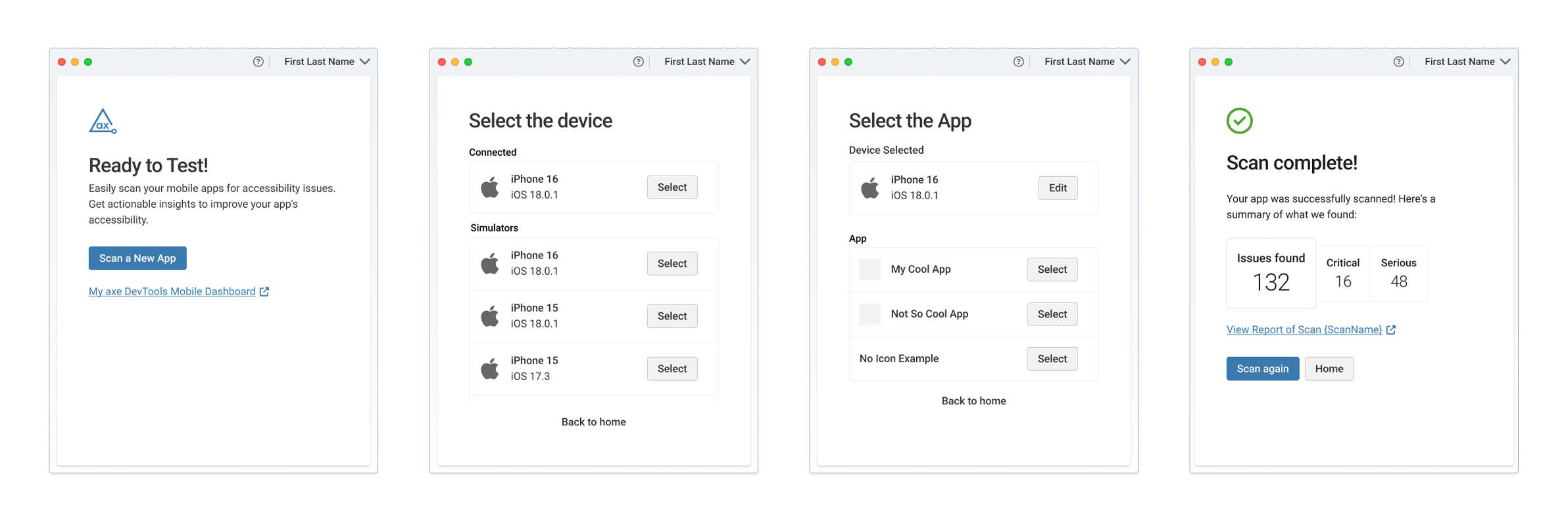
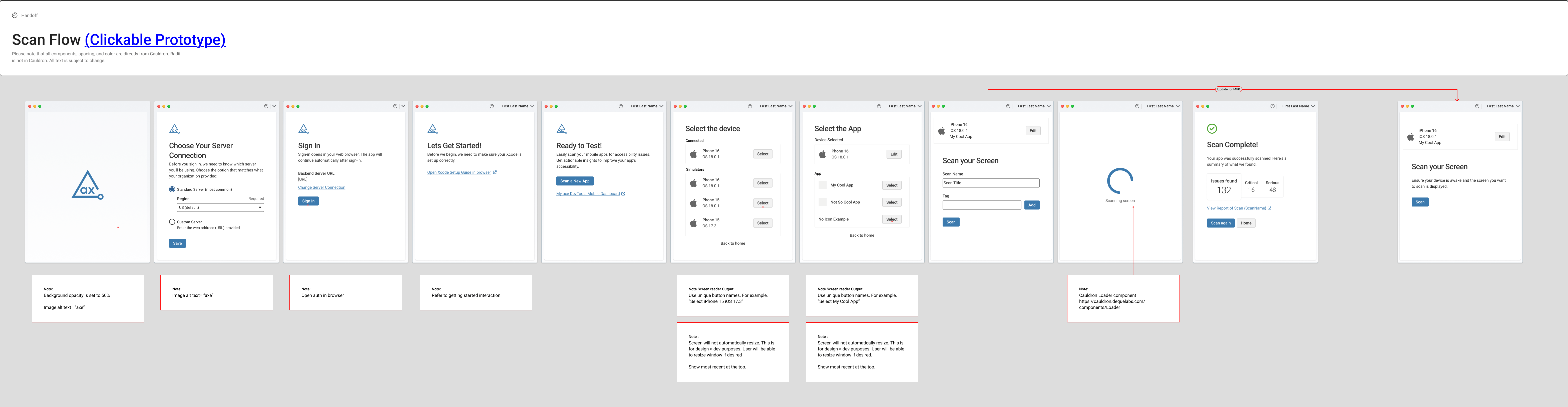
We built a dedicated Electron desktop application that abstracted away the complex SDK setup, reducing the barrier to entry from multiple technical configuration steps to a single line of code.
Key innovation: The desktop application handled all SDK complexity behind the scenes, working within Apple's security constraints while requiring minimal technical knowledge from users. Physical device testing became straightforward, and setup time dropped dramatically.
The impact:
- Non-developers could independently test iOS accessibility
- Quick results would be displayed directly in the application, eliminating trips to the web dashboard
- Users gained confidence to test complete workflows, not just individual screens
- The desktop application established a foundation for centralized mobile testing across both iOS and Android platforms
My role
I led end-to-end UX design in close collaboration with the mobile PM, product owner, and lead developer. My responsibilities included user research, wireframing, prototyping, usability testing, and delivering high-fidelity annotated designs for a quarter-long development sprint.
Tools: Figma, FigJam, User Interviews, Moderated Usability Testing, Custom Claude Project
How we got here
Research: understanding the real barriers
We started by mapping what we knew, what we assumed, and what we needed to validate. Working with the mobile PM and product owner, we used a Certainty, Suppositions, and Doubts (CSD) Matrix to identify risks and avoid design biases.
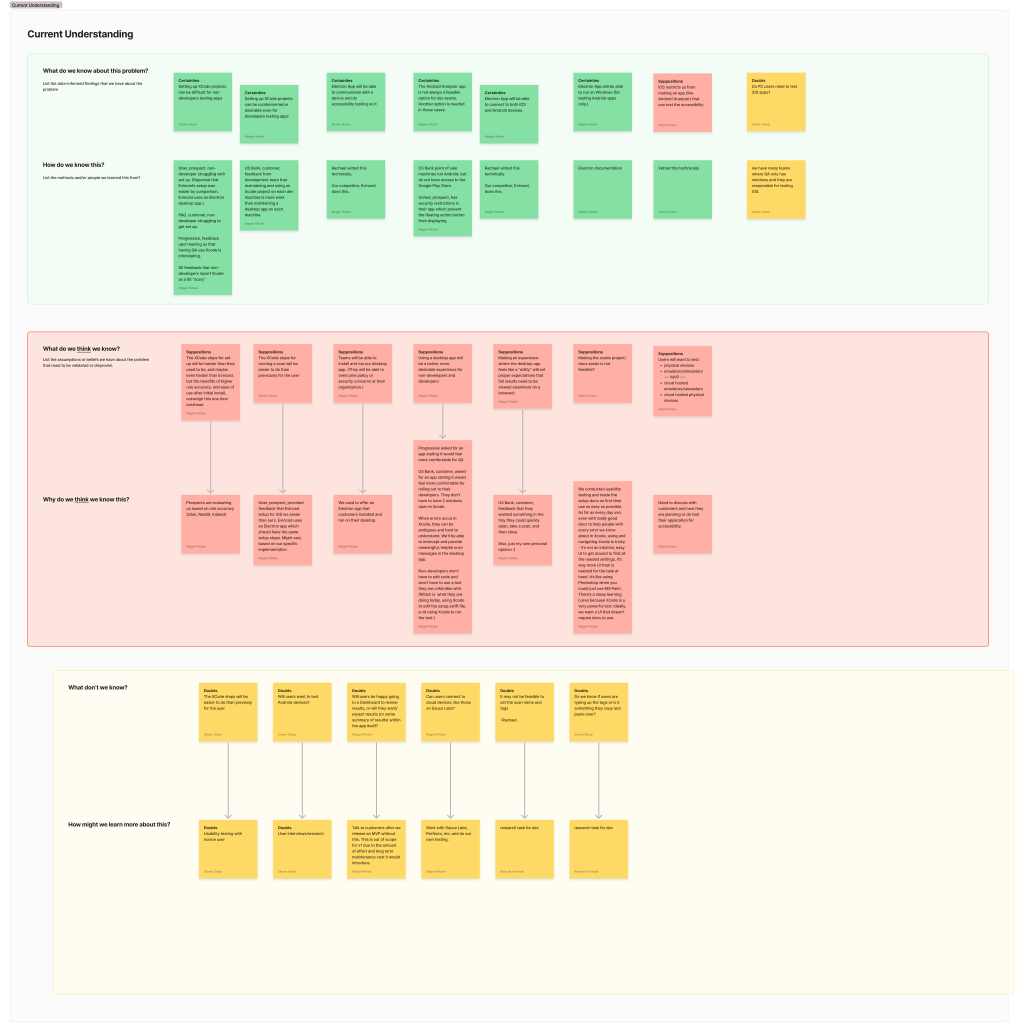
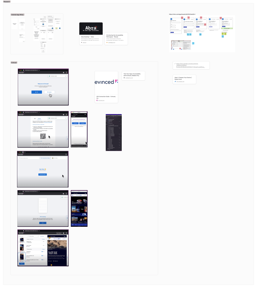
Competitive analysis revealed Apple's security infrastructure was a universal challenge. Competitors took varied approaches: some attempted remote testing solutions, others required similarly complex installation processes, and some avoided iOS testing altogether. Critically, we had a head start, our Android testing application launched a year prior provided valuable insights into mobile testing user behaviors and expectations.
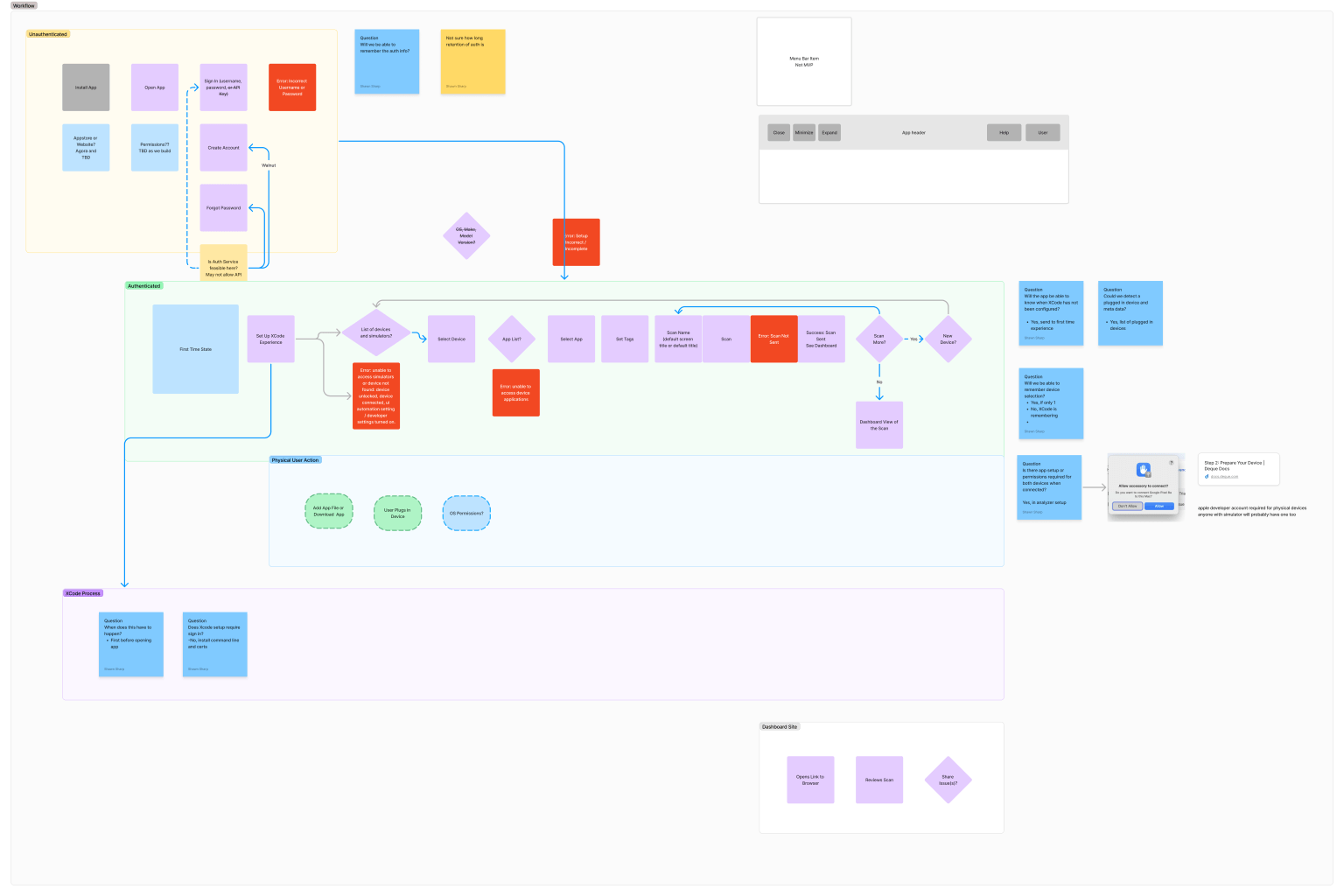
We mapped the entire user workflow step-by-step, identifying friction points and opportunities. The key questions driving our research: If Xcode setup is the primary barrier, how do we make this fundamentally easier? What makes a desktop application truly valuable beyond just wrapping the SDK?
Design strategy: simplicity through technical abstraction
Time and cost constraints eliminated virtual machine solutions. Most users had physical devices readily available. The breakthrough was recognizing an Electron desktop application could handle SDK complexity while working within Apple's security model and Mac ecosystem requirements.
Our design philosophy: Get users testing as fast as possible with zero technical friction.
The desktop application absorbed the complex SDK configuration screens, managing all technical requirements after initial installation. While Xcode remained necessary (Apple's requirement), we reduced the coding requirement to a single line, dramatically lowering the intimidation factor.
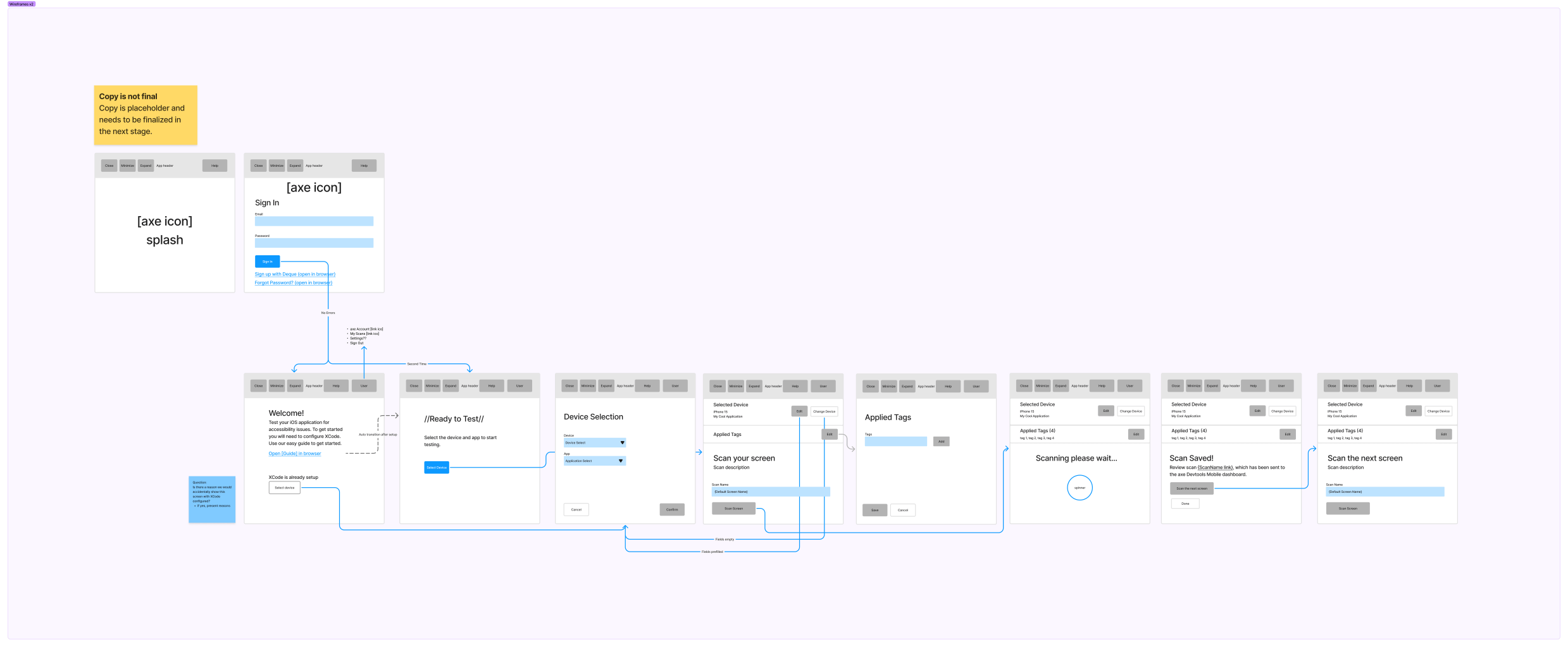
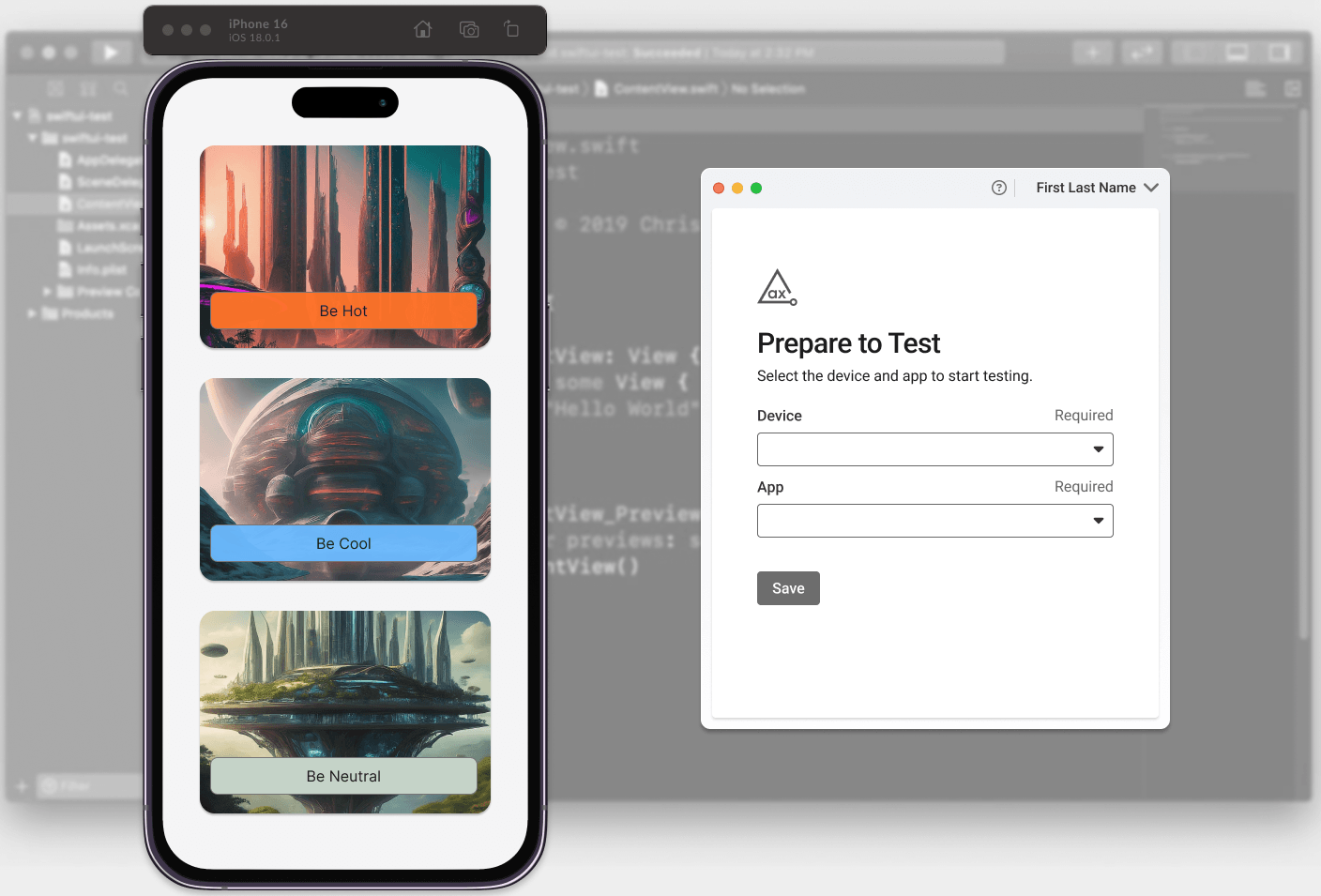
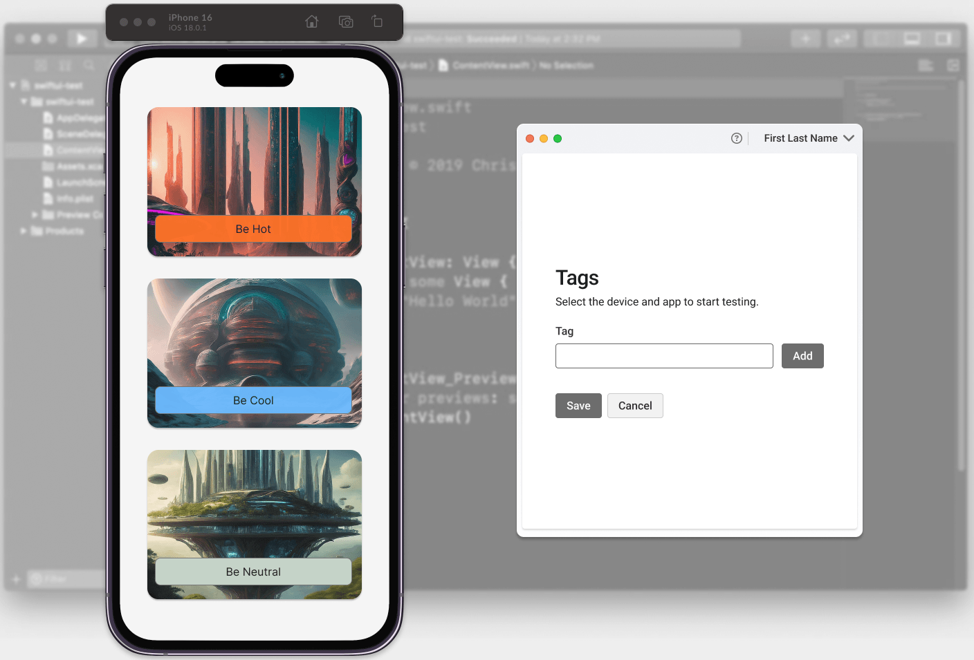
Wireframing focused on minimum viable interactions. For a user testing a single screen, what information was truly essential? Should we request a test name? Tags? Should the application remember device preferences? These questions led to a clean, spacious design that prioritized speed over configurability.
We integrated our accessible, in-house React design components for visual consistency across the Deque product family. To ensure content clarity and brand voice consistency, I created a custom Claude project configured with specific accessibility guidelines, readability standards, and brand voice requirements. This ensured every piece of interface copy remained clear, simple, and jargon-free throughout the product.
Knowing the application would occupy limited screen space, we embraced whitespace, Inviting users in rather than overwhelming them with options.
Prioritization and collaboration
Throughout the quarter, I worked directly with the lead developer and our technical product owner to meet our aggressive launch timeline. We made strategic scope decisions:
- Avoided complex virtual environments beyond Xcode's built-in capabilities
- Deferred in-app tagging to post-launch (tags could be applied via the web dashboard, and Android app research suggested this was a smart fast-follow feature)
- Mapped every possible error state with the lead developer to prevent wasting development resources on solutions for assumed errors that would not actually occur
This collaboration ensured we built the right solution within our constraints.
Testing: validating with real users
We conducted moderated remote usability testing sessions with participants new to Xcode and accessibility testing, our target novice users. We also gathered early feedback from initial customers to validate our direction.
Testing revealed two critical usability issues:
- Help link discoverability: Users struggled to locate the Help feature
- Tag application confusion: Users were uncertain when tags were actually applied to their tests
The tagging issue was particularly instructive. Our initial design used implicit tag addition (a pattern observed in other applications), but testing confirmed it lacked clarity. The solution was elegantly simple: add an explicit "Add" button after the tag text field. This single change dramatically improved usability and user confidence.
This feedback loop transformed theoretical designs into intuitive experiences for real users.
Results display: meeting users where they are
One significant improvement emerged from understanding user workflow needs: displaying test results directly in the application. Users wanted immediate feedback, is this screen clean or does it have accessibility issues?
Previously, users received only a generic "success, we scanned the page" confirmation, requiring them to navigate to the web dashboard to see actual results. Adding a simple issue count on-screen eliminated that extra step, giving users confidence to continue testing complete workflows or investigate issues immediately. This small change had substantial impact on testing efficiency and user satisfaction.
Key learnings
Simplicity wins, even for complex technical challenges. We demonstrated that accessibility testing can be both intuitive and visually appealing. While developers often desire extensive configuration options, our testing consistently showed that simplified, focused designs satisfy the broader user base.
The Help button paradox. Testing revealed that even standard UI patterns like Help button placement can confuse users when duplicated or positioned inconsistently. As one participant noted: "This is interesting. Because there is a need help here and there is also a like, a help button here." Clarity always trumps conventional placement.
Hub environments reduce friction. The desktop application's potential to centralize all mobile testing (iOS and eventually Android) creates a significantly more seamless user experience. Keeping users in one environment eliminates tool-switching overhead.
User feedback improves the entire product ecosystem. Insights from this project clarified design patterns across all Deque products, demonstrating how focused user research can generate value beyond a single project. We continue refining based on feedback as the product reaches full release.