
Simplifying user invitations
Reducing a 10-step invitation process to 4 by eliminating redundant verification and surfacing critical requirements upfront.
The problem
Enterprise customers were creating their own documentation to help employees get started with our products. These PDF guides, complete with screenshots and step-by-step instructions, revealed a critical usability failure in our invitation flow.
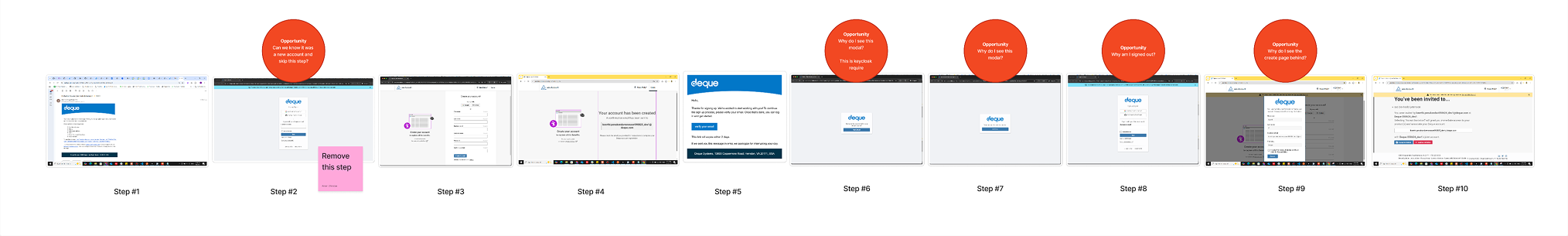
As one enterprise customer told us during a call: "It takes 13 steps just to get started."
In reality, it was 10 steps, but that was hardly better. Users bounced between the web browser and their email repeatedly. The flow was fragmented, confusing, and inconsistent across different scenarios (SaaS, SSO, on-prem). Years of patched repairs had created mismatched terminology and unnecessary verification steps.
The consequences were significant:
- Enterprise customers were spending time creating workaround documentation instead of trusting our product
- Support tickets piled up from users who accidentally signed up with different emails than their invitations
- The experience felt dated. Customers repeatedly described our interface as "Windows 95"
- New users faced friction before ever reaching the product, damaging first impressions
- Inconsistent flows across deployment types created confusion and eroded trust
This was not just a usability problem. It was a credibility problem. We needed to eliminate the redundant steps, create consistency across all scenarios, and bring the experience into the current era.
The solution
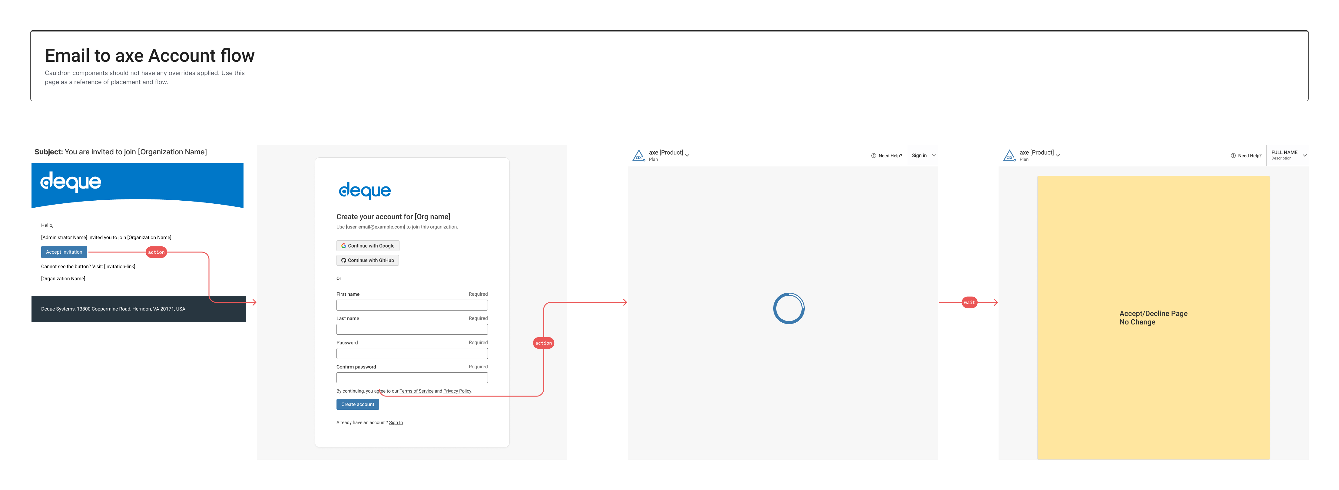
We reduced the invitation flow from 10 steps to 4, eliminating redundant verification steps and front-loading critical requirements. The redesigned flow keeps users in a single context, removes unnecessary form fields, and provides a modern, accessible interface.
Key innovations:
- Moved terms and conditions consent upfront instead of mid-flow, eliminating a step and meeting legal requirements earlier
- Removed the signup form entirely since invited users already have validated email addresses
- Eliminated redundant email verification in invite flows (the invitation itself serves as verification
- Consolidated user interactions behind loading states, hiding unnecessary complexity
- Refreshed visual design with improved spacing, structured layouts, and modern aesthetic
The impact:
- 60% reduction in steps (from 10 to 4)
- Eliminated common support issue (wrong email during signup)
- Single, consistent flow across all deployment scenarios (SaaS, SSO, on-prem)
- Modern interface addresses long-standing "dated" perception
- Currently in development, scheduled for Q1 2026 release
My role
I led end-to-end UX design in close collaboration with the product manager. This project was part of the account section I primarily support. My responsibilities included flow auditing, stakeholder research, interaction design, accessibility compliance, and delivering final designs. I worked with QA to document all flows, collaborated with the lead developer on technical constraints, and coordinated with security and legal teams on compliance requirements.
Tools: Figma, User Flow Workshops, Wireframing, Accessibility Annotations
How we got there
Research: understanding the fragmentation
When we started, we had feedback from large enterprise customers who complained loudly about the invitation experience. Smaller customers tended to accept the problems, but enterprise clients made their frustration clear. This project had been a persistent pain point but never prioritized until customer complaints became impossible to ignore.
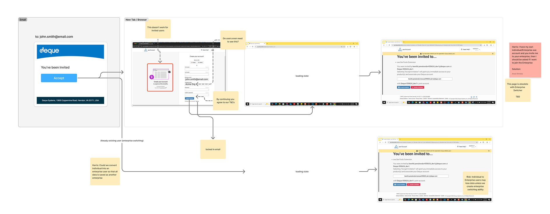
I began by auditing all invitation flows across our products. What happens when you add a user in on-prem versus SaaS? What differs between inviting an admin versus a regular user? Are flows consistent across solutions or completely different?
With help from our QA team, I documented 9 different invitation-related flows and an additional 6 flows for deleting or managing users. Mapping these side-by-side revealed the extent of the problem.
Key research insights:
Years of patch repairs created an inconsistent mess. Some flows used different terminology. Others had simplified certain steps while leaving others bloated. The most critical flows, the ones customers used daily, needed immediate attention.
Customers were creating workaround documentation. The fact that enterprise customers were producing PDF guides with screenshots showed our flow was too complex to navigate without external help. This was embarrassing evidence of our usability failure.
4 to 5 steps were pure fluff. Once all flows were visible side-by-side, it became immediately obvious which steps added no value. Email verification in an invite flow? The user already received the email. Signup forms when we already had their email? Unnecessary friction that caused support tickets.
I worked with the lead developer who understood Keycloak (our identity management system) inside and out. I needed to understand why we made certain decisions historically and whether changing them would break other systems. This partnership ensured we could simplify without introducing technical debt.
Design strategy: eliminating redundancy
I created wireframe flows to review with stakeholders and the development team, ensuring we were not designing ourselves into a corner or removing critical information. This became an iterative process with security and legal teams.
Our core design principles:
Surface critical requirements upfront. We moved terms and conditions consent to the beginning of the flow. This eliminated a mid-flow interruption and satisfied legal requirements earlier. Security and legal initially had concerns about removing the explicit checkbox in favor of "by continuing you agree to..." language, but we worked through compliance requirements together.
Remove redundant verification. In an invite flow, we already sent the email to the user. Email verification was duplicating work we had already done. We eliminated this step entirely.
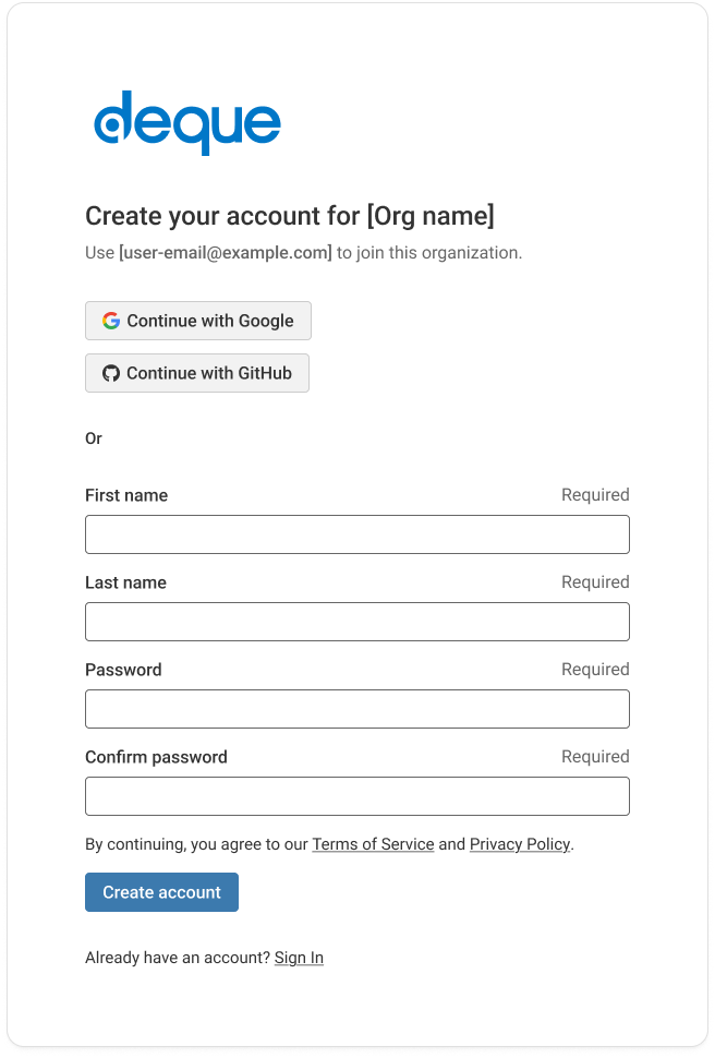
Eliminate the signup form. Users were receiving invitations with their email addresses already specified. We reduced form fields from 6 to 4, removing business email and company name since users were being invited to an existing company solution. Asking them to re-enter information we already had created opportunities for error and unnecessary friction. We had support tickets from users who accidentally signed up with different emails than their invitations. Simplifying the form to just first name, last name, and password (with confirmation) eliminated the entire problem.
Hide complexity users do not need to see. The small amount of time required to provision a user account does not need user interaction. We moved these processing steps behind loading indicators, reducing perceived steps while maintaining the same backend processes.
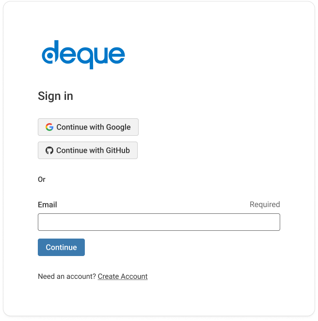
Bring the interface into the current era. Customers repeatedly called our interface "dated" and compared it to "Windows 95." Working within our Cauldron component library constraints, I refreshed the sign-in forms and invite forms with improved spacing, structured layouts, and generous white space. I had done this successfully on another project and knew I could elevate the experience again.
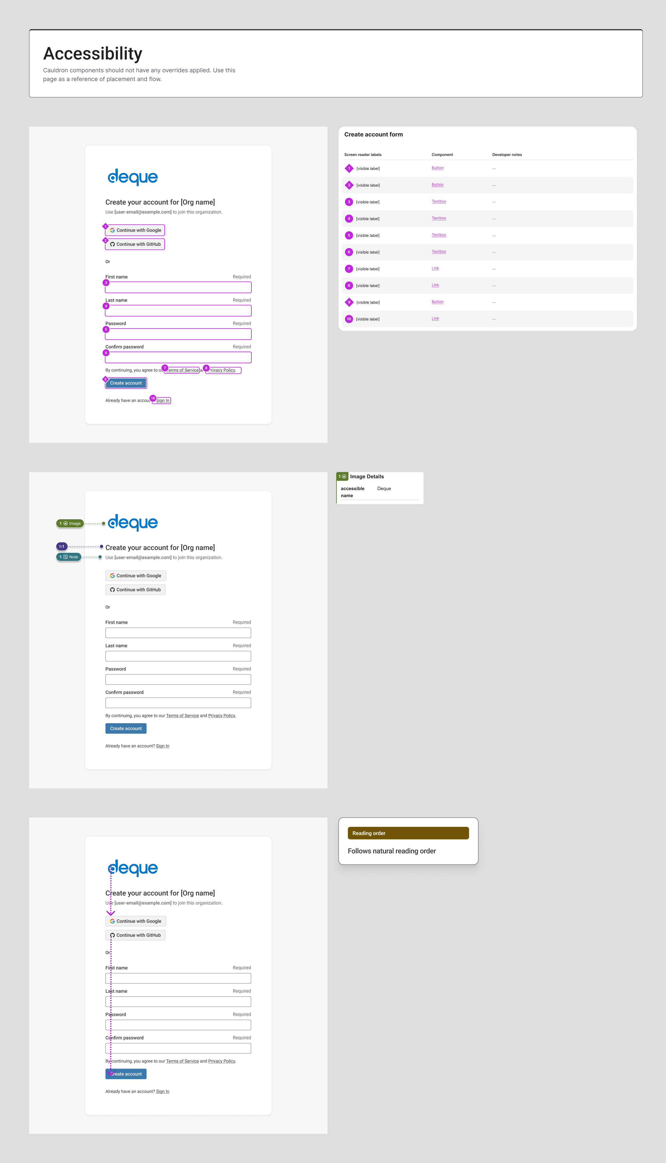
Maintain accessibility throughout. Every design decision included accessibility considerations. I created detailed annotations showing keyboard navigation, screen reader behavior, and ARIA implementations to ensure the simplified flow remained fully accessible.
Constraints and Collaboration
This project required coordinating multiple stakeholders with different concerns:
Technical constraints: We had to continue using Keycloak for identity management. We needed to support Google and GitHub as authentication providers. The solution had to work across all deployment scenarios: SaaS, SSO, and on-prem installations.
Component constraints: We had to work within our Cauldron component library, a small set of accessible in-house components. This limited some design options but ensured consistency across products.
Compliance requirements: Security and legal teams needed assurance that simplifying the flow would not introduce vulnerabilities or legal risk. The iterative review process ensured we met all requirements while dramatically improving the experience.
Results
The redesigned invitation flow is currently in development and scheduled for Q1 2026 release.
We reduced steps by 60%. From 10 steps down to 4 (arguably 3, since one is a loading state). Users now complete invitations in a single browser context without email interruptions.
We eliminated a common support problem. By removing the signup form, we prevented users from accidentally registering with different emails than their invitations. This support ticket category will disappear entirely.
We created consistency across all scenarios. One unified flow now works for SaaS, SSO, and on-prem deployments. Users experience the same streamlined process regardless of their organization's setup.
We modernized the interface. The refreshed visual design addresses long-standing customer feedback about the product feeling "dated." Improved spacing, structured layouts, and modern aesthetics bring the experience forward.
Key learnings
Technical debt becomes visible when you map everything. Documenting all 9 invitation flows and 6 user management flows side-by-side made years of inconsistent patches immediately obvious. Without this comprehensive view, we would have continued patching individual flows rather than solving the systemic problem.
Redundancy hides in plain sight. Once we questioned each step, the redundant verification became obvious: we were verifying emails we had already sent invitations to. Sometimes the solution is not adding something new but recognizing what can be removed.
Workaround documentation is a failure signal. When customers create their own guides to navigate your product, they are telling you the experience is too complex. Enterprise customers should not need to produce PDF documentation for a basic invitation flow. Their workarounds were a clear signal of our failure.
Constraints drive creativity. Working within our limited component library while refreshing the visual design forced creative solutions. Spacing, layout, and white space can dramatically improve perceived modernity without requiring new components. Sometimes elevation comes from better use of what you already have.